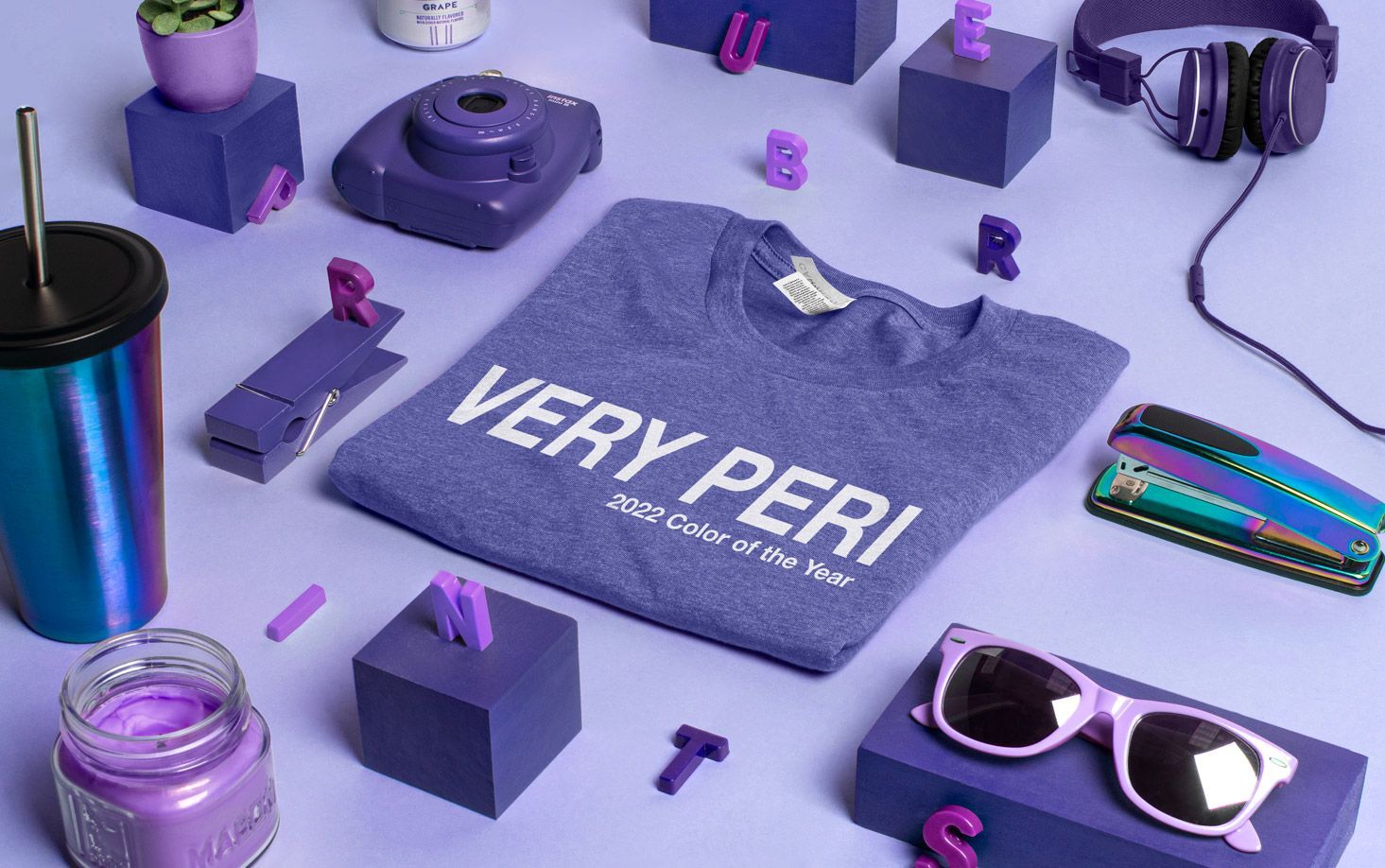
This year, Pantone went outside the box and decided to create an all-new color for the Pantone of the Year, “Very Peri” PANTONE 17-3938.
The dark periwinkle isn’t a far stretch from many colors already in existence from the color swatch book. (It’s very reminiscent of Nintendo’s Indigo Game Cube from 2001…)
So why create a new one?
Trendsetters don’t just pull color chips out of a hat. The previous year is a springboard to judge what we need as a society from a color in the coming year.
Pantone believes this is the year to create a new color to symbolize the rebirth of society post-pandemic. “We felt it was so important to put together a color that encapsulated the feeling of newness,” Leatrice Eiseman, executive director of the Pantone Color Institute™ (PCI), said.
This is still a first. In its 23-year history, Pantone has never created a brand new color for the year. Pantone has the largest library of colors available, over 3,000. Creating a new color seems over-indulgent for the color titan. But there’s thought behind it.
According to the institution, “[this] reflects the global innovation and transformation taking place. As society continues to recognize color as a critical form of communication, and a way to express and affect ideas and emotions and engage and connect, the complexity of this new red violet-infused blue hue highlights the expansive possibilities that lay before us”.
Basic color psychology tells you blues can be trustworthy and tranquil while violets can be mysterious and uplifting. Blending gives you a mix of both qualities.
Pantone clearly marks 2022 as a new beginning for us in many ways.
“As we emerge from an intense period of isolation, our notions and standards are changing, and our physical and digital lives have merged in new ways. Digital design helps us to stretch the limits of reality, opening the door to a dynamic virtual world where we can explore and create new color possibilities.” - from the Pantone Color Institute.
Last year was a special year, too. Even though it has happened before, Pantone rarely chooses a corresponding pair of colors for the year. For 2020, the colors were PANTONE 17-5104 Ultimate Gray and PANTONE 13-0647 Illuminating.
These colors were meant to represent strength and hopefulness. They described the colors as fortifying and cheery, something uplifting after a rough year.
This fits the larger trend Pantone has set with other color choices in previous years: Uplifting, positive spins on all their colors. Yes, some colors are darker, but these colors are described as “confident” and “dependable” rather than “moody” or “dark”.
Each year, carefully-selected colors usher in a new year to inspire the designers of the world.
History of Pantone Color of the Year
New colors can do all that? Seems so.
Pantone Color Institute™, the leader in color and design, has released their Color of the Year since 1999. The first color selected, Cerulean Blue, went from an obscure adjective to a commonplace reference in the everyday vernacular.
The colors aren’t just picked out of a hat each December. Color professionals (who knew there was such a thing) take a 10,000 ft view by looking at color trends across the board. Of course, fashion and home styling are considered but just as much as the automotive industry and film-making. Color trends are in every space, so color professionals are very well-versed.
But Pantone’s Color of the Year doesn’t only forecast or amplify existing color trends, over time, they’ve begun to create trends.
Everyone wants to be a trendsetter, but few actually do it. Pantone did it with their uniformity.
The creation of the ultimate color matching system launched Pantone from an industry-specific reference to a worldwide color juggernaut. Their Pantone Color Matching System (PMS) standardized how professionals across industries matched colors for accuracy and consistency. The system was so successful in replicating colors designers across industries began to adopt it from textiles and apparel to beauty and industrial design.
Every industry looked to Pantone for its color insight. Meaning industries across the board began to implement Pantone’s recommendations. When the Pantone Color Institute began rolling out their “Colors of the Year” designers in every industry adopted the fad.
From wall paint to retail racks to cars to websites to t-shirts — Everyone is on the Pantone train.
Pantone in T-Shirts
Everyone is on the train, including us in the custom t-shirt business. Pantone has been a godsend for color matching between different color systems. We rely on the Pantone color values to communicate specific colors between our Art and Production departments. Our Art Department notes the Pantone colors in designs and sends it over to our production team.
Bonus Tip: If you know which Pantone values you’d like for your uploaded image or logo, add it to the Special Printing Instructions text box in the Design Studio. We’ll make sure the Pantone values are aligned throughout production. Keep in mind, if you selected a Pantone color you found online, the printed color may vary since your computer monitor will distort the color (all computer monitors interpret colors a little differently).
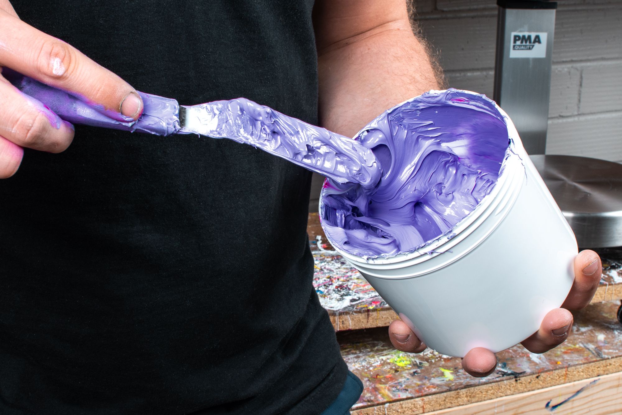
Call us old-fashioned, but there’s no substitute for a physical color book.
For ink mixing, we use the Pantone-certified formulas to get the colors precise. Our inks are mixed by hand and checked against the physical Pantone book. We do this to confirm the colors printed are accurate at every step.
For digitally printed orders, we’ve already calibrated the ink in the printers to represent correctly on the finished product.
Thankfully colors don’t exist in a vacuum. When choosing which colors should be the primary, secondary, and tertiary colors, you’re exercising color hierarchy which is a part of color theory. In working with t-shirts you have more than just the ink on the shirt to consider, you have the t-shirt color itself as a color element.
Your color choices on your shirts matter — Which is why we use the industry standard, the Pantone Matching System. We’re able to create hundreds of different colors based on this system which allows us to get your orders correct every time.
Very Peri is a new addition to the massive library of colors at our disposal. One thing is certain: Color trends come and go over time, but color basics are the most important element to understand when designing a t-shirt.
Take a look at which color combinations are popular today to start designing your t-shirt with color in mind.