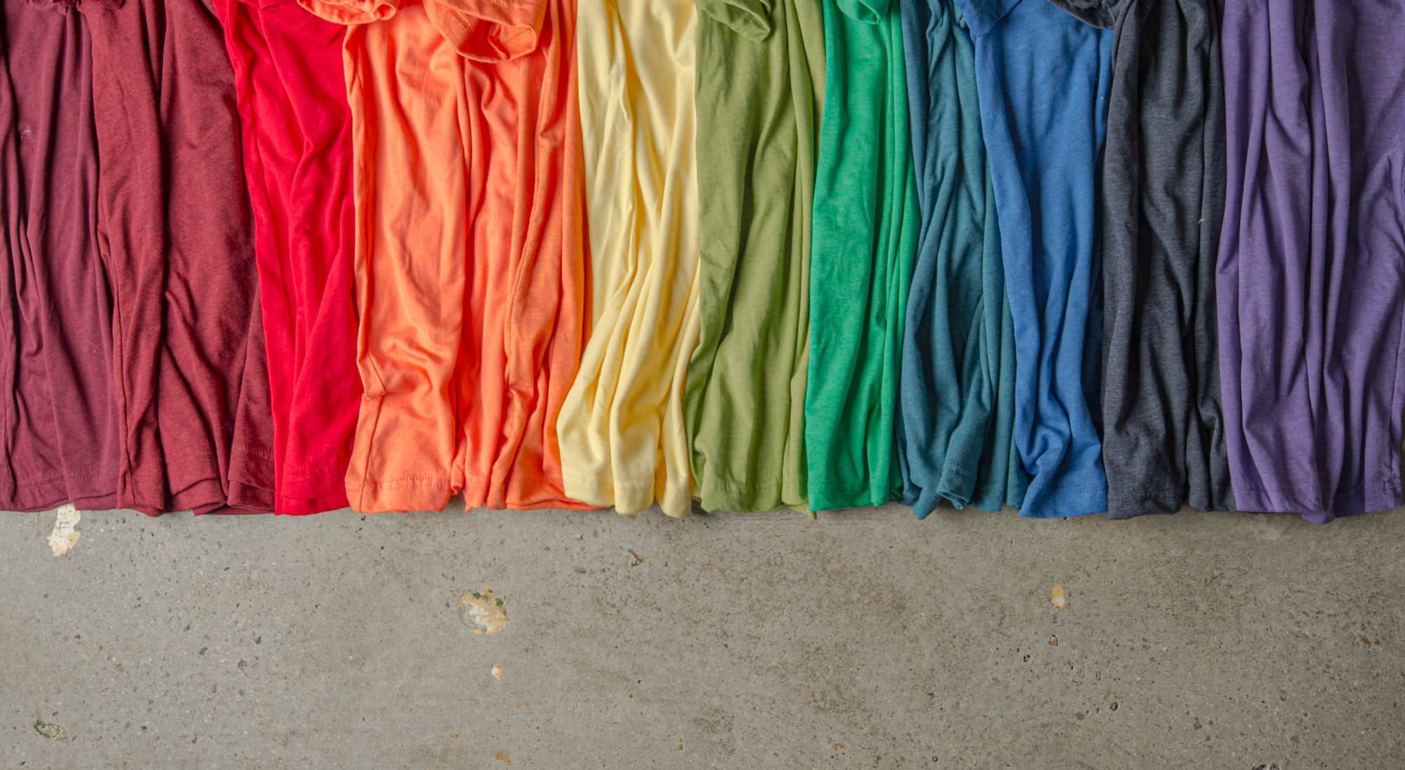

When approaching any design project, one of the most important things to consider is your color palette. T-shirt designing is no different and knowing a bit of color theory can make even amateurs look like seasoned professionals. We’ll go over the basics of color theory and give you some advise for when you’re designing your own t-shirts. Stick around for some t-shirt color palette inspiration and helpful tips to get you started.
tl;dr
The concept of color harmony is an easy short-cut to making your own professional-looking t-shirt designs. Start with an understanding of complementary, analogous, and monochromatic color schemes and then use shades, tints, and tones to tweak them for the right feel. And in the end, contrast is king.
Color theory basics
Color theory is the study of the relationships and effects of color. It’s the application of art and science to determine what colors look good together and how those colors control the style of your design. To give you the full picture of how to apply the ideas of color theory to your own t-shirt designs, we’ll introduce the color wheel, the concept of color harmony, and examine how to use colors together to create your style.
Outline
- The color wheel
- Color families
- Hue, shade, tint, and tone
- Creating contrast
- Color harmony
- How do you apply this to your t-shirt design?
- Conclusion
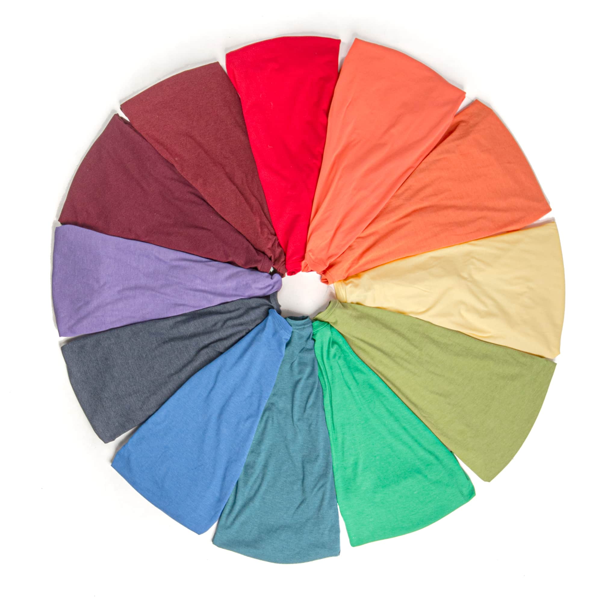
The color wheel
Sir Isaac Newton developed the first circular color diagram in 1666. Since then, the color wheel has been the basis of color theory and used to visualize the relationship between colors. Using their position on the color wheel, we can define color combinations and create pairings that work well together. The basic anatomy of the color wheel is divided into primary, secondary, and tertiary colors as shown below.
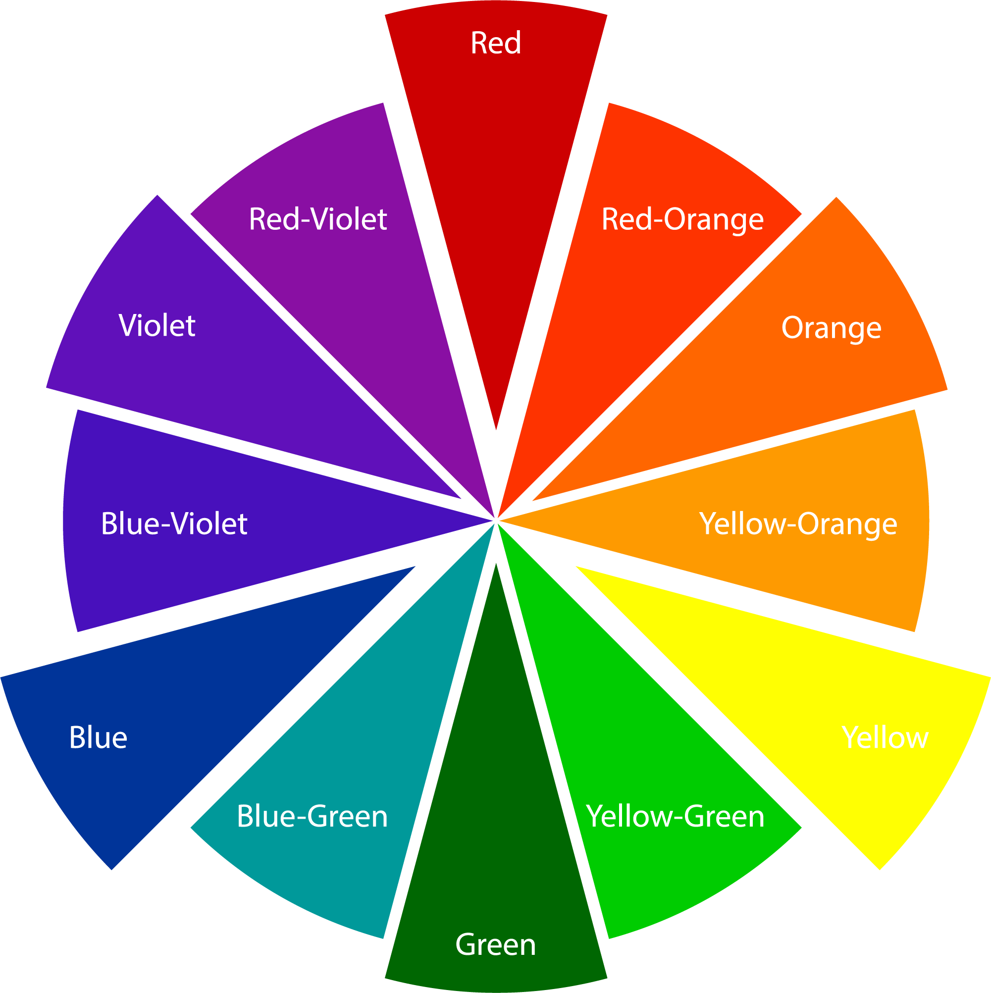
Primary Colors are Red, Yellow and Blue. These colors are combined to create all other colors.
Secondary Colors are Green, Orange and Purple and are created from combining two primary colors.
Tertiary Colors are Yellow-Orange, Red-Orange, Red-Purple, Blue-Purple, Blue-Green & Yellow-Green and are created by combining a primary color with a secondary color.
Next, we'll get into more ways we can talk about colors and we'll use the color wheel as a backbone to define categories and relationships between different colors.
Color families
The first and most basic way we can define color relationships is by their color family, often referred to as color temperature. If you draw a line through the center of the color wheel, you’ll separate the warm colors from the cool colors. Warm colors consist of reds, oranges and yellows while cool colors are blues, greens and purples.
Warm colors
Warm colors — as you can probably guess — get their name from their association with heat or shine. But warm colors are also used to evoke thoughts of excitement, playfulness, or even anger. All are stronger and more forward emotions that you can tweak depending on which warm tone you use.

Cool colors
Cool colors are usually associated with the opposite emotions and are calming, relaxing, or even somber. These colors are often used to create more subdued color pallets, but not always. The way these color families affect the style of your t-shirt design ultimately comes down how you pair them with the rest of your color pallet.

For now, just make note of this information. We’ll come back to how to actually use these color families and design your own shirts.
Hue, shade, tint, and tone
You might be looking at the color wheel and thinking, well, that’s not every color. And that’s because the color wheel is used to display the most basic colors called hues.
Hue refers to the most fundamental version of a color — e.g. blue, orange, purple, etc. And we can modify these basic hues to create additional variations called shades, tints, and tones for even greater variety and control in our color schemes.
Adding black to a color, or making it darker, creates what we call shades. Adding more black will create an even darker shade and you can pair a variety of shades together which all use the same hue.

If instead we add white to a color, or lighten it, we create tints. And just like with shades, you can lighten a single hue to different degrees to create a variety of tints.

And finally, we have tones. Tones are created by adding grey to a color which effectively lowers the color intensity making it more muted and subdued. The idea is that the original hue is made no lighter or darker, but is instead made less saturated and often softer and more pastel.

Next we'll look at how we can take these ideas about color families and modifying hues with shades, tints, and tones to start building interesting color relationships. These initial fundamentals are crucial though in understanding what comes next.
Creating contrast
The variations we've talked about are important because they allow us to play with contrast in different and unique ways. Contrast just describes how different two colors look next to each other, and using shades, tints, and tones, we can make colors look more or less different. Ultimately, it will be the way that you use contrast in combination with your color pallet that will help you look like a pro when designing your own shirt.
For example, a very dark shade against a very light tint will have higher contrast than two colors of a similar tint or shade.


The same thing is true for tones. Very bright tones against very muted tones will have high contrast while two colors of about the same tone will have lower contrast.


And possibly the most useful way to create contrast is by using different color families. If you remember from the earlier, there are warm and cool colors, and if we use two colors of the same family, we'll have lower contrast. If instead we use two colors of opposite families, we'll have higher contrast.


Just think about these different variations as on a range from one extreme to the other. First, on a range from warm to cool, then a range from tint to shade, and finally a range from bright to muted tone. The further away from each other two colors are, the greater contrast they’ll have between them, and the closer together they are, the lower the contrast will be between them.
This is an important concept because the way to make more sophisticated color schemes is to be deliberate about the kind of contrast you're creating. For instance, you may want a lot of contrast between shades, but not in different color families. Or you may want to contrast different color families, but have colors of a similar tone.
This will make more sense as we go along and when we begin to talk about applying all this to your own t-shirt designs. Next we'll get into the different ways that we can define color relationships with color theory.
Color harmony
Color harmony is just the fancier way of saying that colors look good together. And there are many different ways to combine colors to create color harmony and we can easily define them by their location on the color wheel.
Complementary colors
Complementary colors are colors on opposite sides of the color wheel from one another. If you remember from when we talked about color families, also called color temperature, colors on opposite sides of the color wheel will always be in opposite color families.

For this reason, complementary colors are known for their high contrast. They always pair a warm color with a cool color and therefore create a color scheme that’s often exciting with a lot of visual pop.

You can use complementary colors when you really want to draw attention and create a lot of separation between two colors. However, this color combination can often be a little jarring, so it can be a good idea to dial back the contrast a bit by using colors of a similar shade or of a more muted tone.

Here we're starting to introduce what we touched on earlier, which is being selective with where you create contrast. Complementary color schemes are focused on creating contrast between color families which may lead you to reducing contrast in other areas — but not always!
Analogous colors
Analogous colors are colors that are side by side on the color wheel. And because they’re side by side, they’re usually of the same color family, or at least bridge the gap across color families — e.g. green, yellow-green, and yellow.

These color schemes are generally lower contrast than complementary color schemes making them a little more versatile and focused. For that reason, you can use more saturated colors without the color scheme becoming overwhelming. And if you need to introduce more contrast between colors, just vary their shade or tone to make similar hues stand out from one another.

The inherent harmony in using colors next to each other on the color wheel also makes this a color scheme that's easier to work with. It's a good place to start when you're unsure of how exactly to put together a color palette.
Monochromatic colors
Monochromatic colors are the shades, tints, and tones of a single hue. This color scheme is lowest in contrast but can often lead to a very pleasing design aesthetic. The low contrast gives the combination a more subdued feel that’s easier to work with if you’re new to t-shirt designing.

Monochromatic designs can also often be paired with a variety of t-shirt colors because of the palette's simplicity. And, if you need to make elements stand out, using white or black can give it greater contrast without over-complicating the color scheme.
Triadic and tetradic colors
Triadic colors (from triad meaning three) are a combination of 3 colors evenly spaced out on the color wheel. This is another high contrast combination due to how varied the hues are, but might be perfect if you’re looking for a color scheme that’s extra vibrant and exciting.

Very similar are tetradic colors (from tetra meaning four). They’re also high contrast and used for dynamic designs that need the color variation. For a bit of an advanced color theory lesson — evenly spaced tetradic colors are referred to as square color schemes and are a combination of two complementary pairs.

Comparatively, rectangle color schemes are a combination of two analogous color pairs and are a bit easier to work with but are still some of the most dynamic color schemes you can use. In either case, it’s often a good idea to use more muted tones, like our examples here, so that you can control the color pallet and keep the colors in your design from clashing.

That may be a lot to take in, but just remember that this is mostly explained by the color wheel. Color families are the two halves, complementary is across, analogous is side-by-side, monochromatic is one, and we use shades, tints, and tones to make additional variations.
Next, we'll start looking at some actual t-shirt designs so that you can see how this works in practice and we'll talk about the color theory principles used to create each design.
How do you apply this to t-shirt design?
Now that you understand more about how to analyze color combinations and their basic characteristics, let’s expand to actual use-cases so that you can take this inspiration and use it to design your own shirts.
We'll also introduce a few new things as the color palettes get more complicated that really just build on the basic concepts we've gone over so far.
Designing with a monochromatic color scheme
To start with the simplest example, we created a blue monochromatic t-shirt design that uses a whole range of tints and shades. And that really is the key to success here. Using a wide variety of tints and shades will let you still create enough contrast to allow elements to stand out, and the more colors you want to use, the wider you’ll need to vary them.
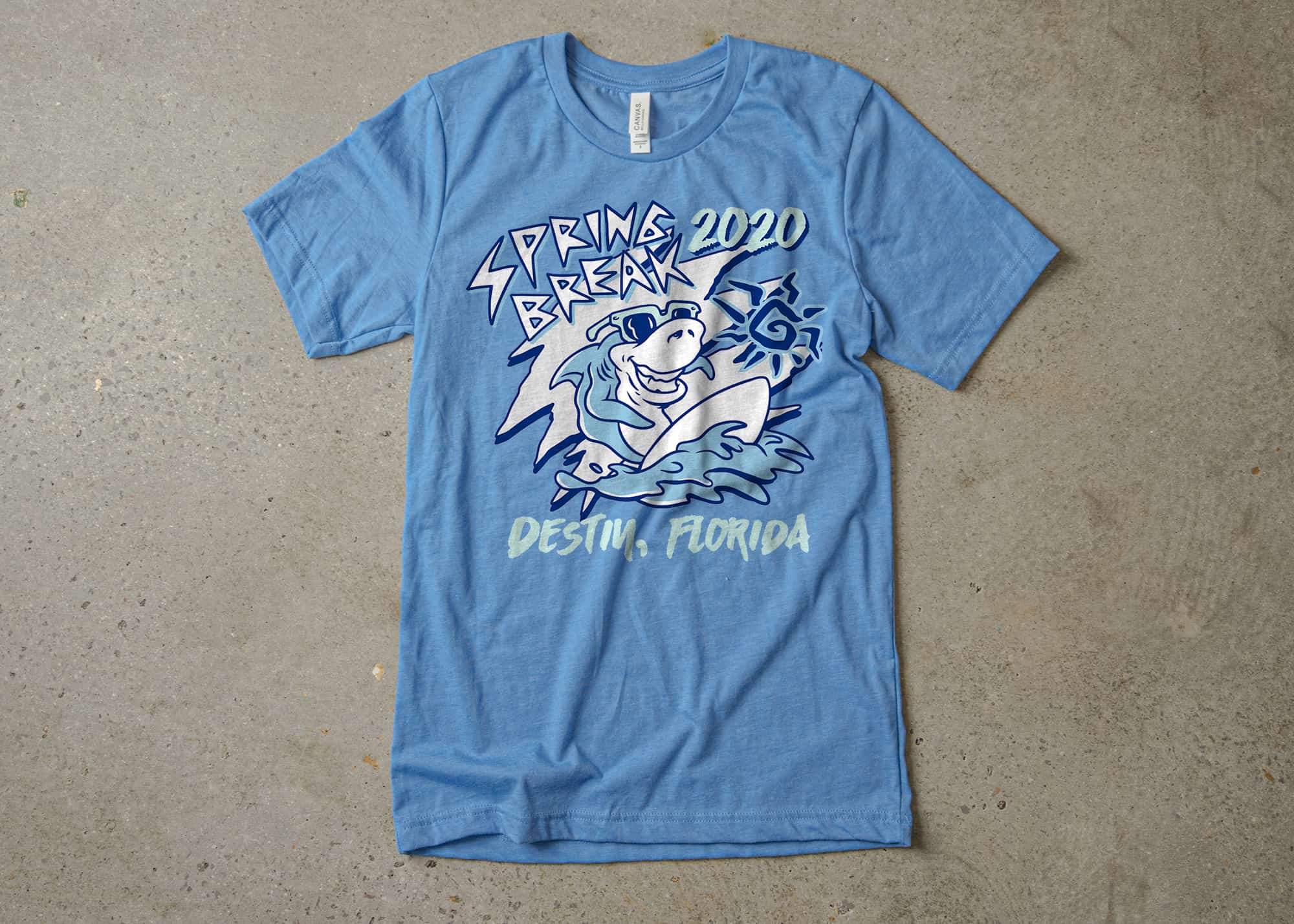
We used an ocean blue Jersey T-Shirt from Canvas to give the design a mid toned background. From there, we have room to add both lighter and darker blues to expand the color pallet and create contrast. For the parts of the design that need to stand out most, we’ve used white so that it’s bright without introducing other hues into our pallet. Similarly, a very light blue is used in areas where we need enough contrast for the text to be legible, but still want it to sit behind the white parts of the design.
One other important detail is where we've used the darkest shade of blue. Whenever you have an outline, it's often best to use the darkest of the colors in you palette. This grounds your design and makes the edges clear and bold.
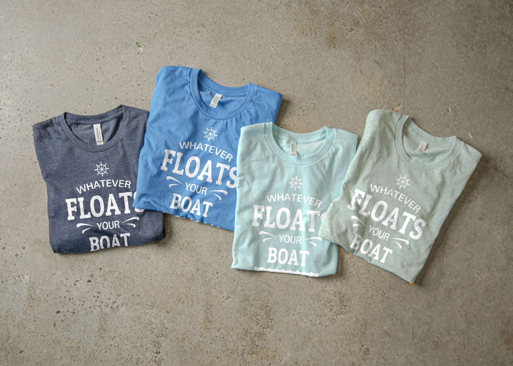
We’ve included a similar color pallet using multiple fabric colors from the same Jersey T-Shirt to show you how you can expand this idea beyond just the design color pallet. If you need to design your own shirt for an event or group order that calls for multiple t-shirt colors, it’s a good idea to keep your design to something very simple like this all-white design.
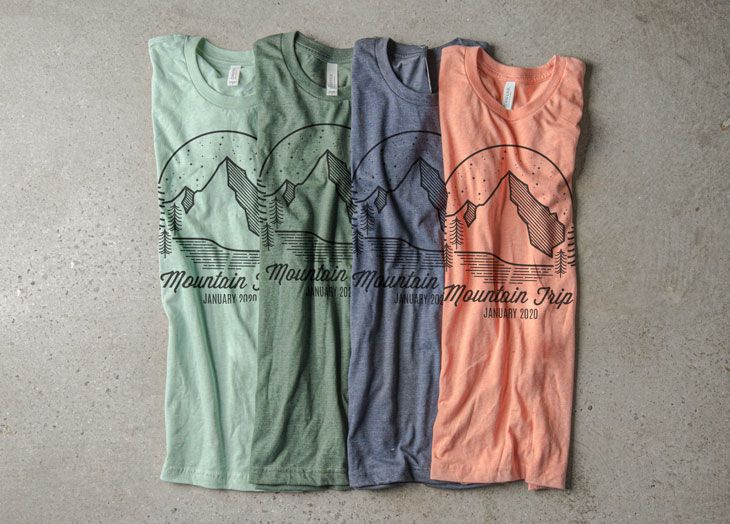
Designing with an analogous color scheme
Baby-stepping our way into more complicated color schemes, we're taking a look at our Strawberries and Cream color palette. You can see how using colors that are next to each other on the color wheel gives this design a focused style but with a bit more variation than we saw in our monochromatic design. The secrets to success here are the variations in color temperature and shade.
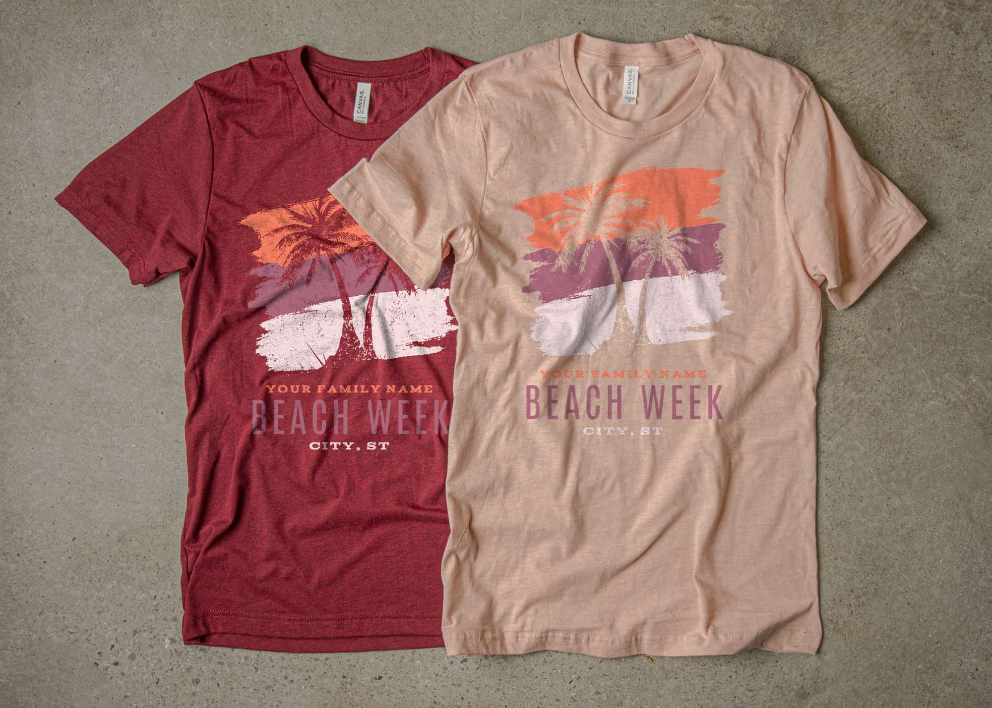
The coral ink color is warmer and lighter, creating a nice contrast against the comparatively cooler raspberry ink color. All these are from our set of Design Studio colors and you can design your own shirt just like this with this family vacation t-shirt design template.

Each color, while also being different in hue, is also different in shade so that we can create more contrast in some areas and also have a bit more subtlety in others. This difference in shade is what allowed us to put the same design on both heather prism peach and heather cardinal shirt colors. One fabric color is the darkest shade in the color pallet while the other sits evenly between the pale pink and coral ink colors.
Again, we’ve created a similar pallet with fabric colors to express the same idea. If you’re looking to order multiple shirt colors for a group, use the same color theory concepts we’ve learned for designing on t-shirts to make sure that your multiple fabric colors match.
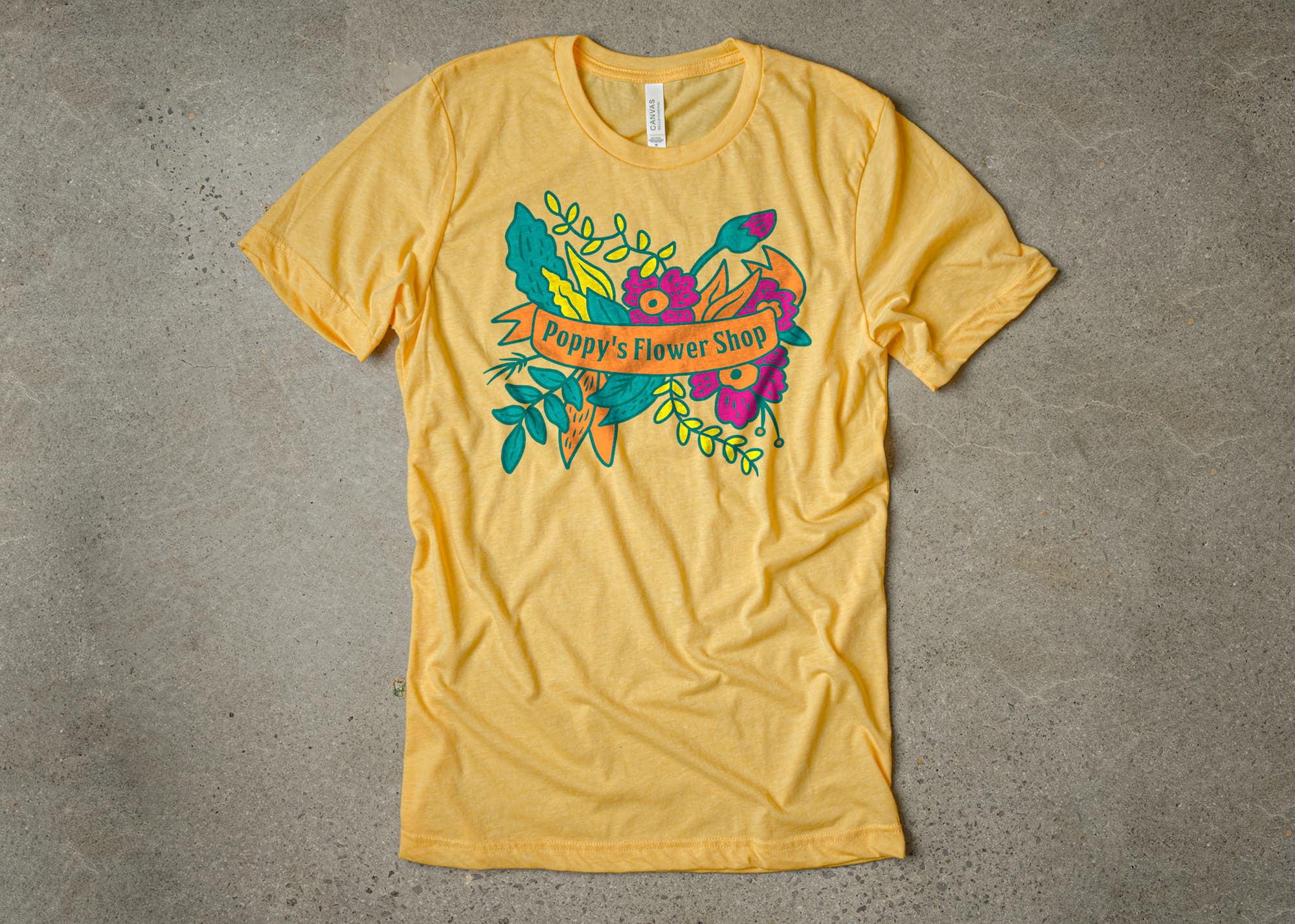
Designing with a complementary color scheme
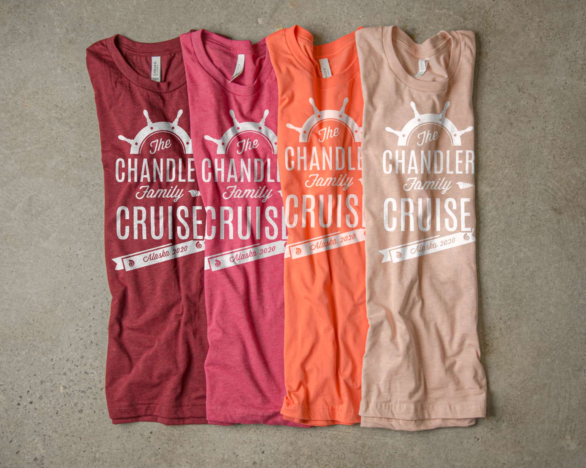
A complementary color scheme is a good go-to, but when you start to introduce more than 2-colors, things can get a bit complicated. Two high contrast colors are often enough and introducing more is often where new designers go wrong. Using our Riverside t-shirt color palette, we show you how to use complementary colors without letting your color pallet get out of hand.
What we’ve done here is actually what’s called an accented analogous color scheme. Our design uses the blue shirt color with navy and green ink — all analogous colors — and contrast them with a complementary orange. Because complementary color schemes are often jarring, it can be a good idea to introduce a few analogous colors to allow the complementary color to serve as the single bright accent. When designing your own shirts, being selective about where you want to highlight contrast just might be the number one key to success.

When we swap out the blue shirt color for this heather sunset fabric color, you can see how the design still works because it’s analogous to the orange ink color. Across the board, we’ve chosen to use more muted tones to further tame the contrasting color temperatures and it’s those more subtle tones that allow the design to work even on the brighter shirt color.
Here, we have the color pallet created from various shirt colors, this time printed with black ink instead of the white we’ve seen in our previous examples. It’s a bit more natural-looking and if you’re designing t-shirts for an event, the complementary shirt color is a great opportunity to let staff or volunteers stand out from the rest of your participants.
When designing your own shirts, being selective about where you want to highlight contrast just might be the number one key to success.
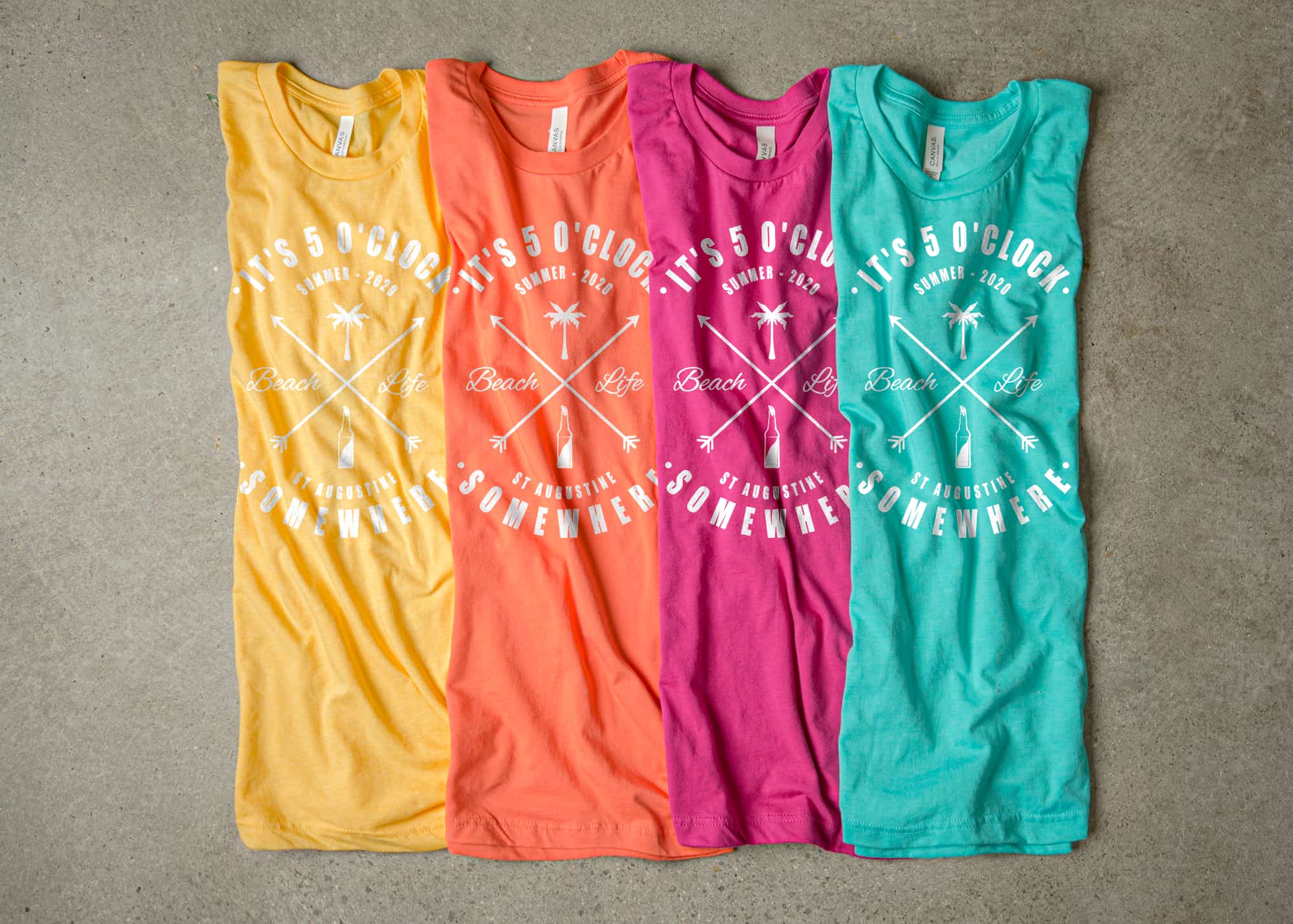
Designing with a tetradic color scheme
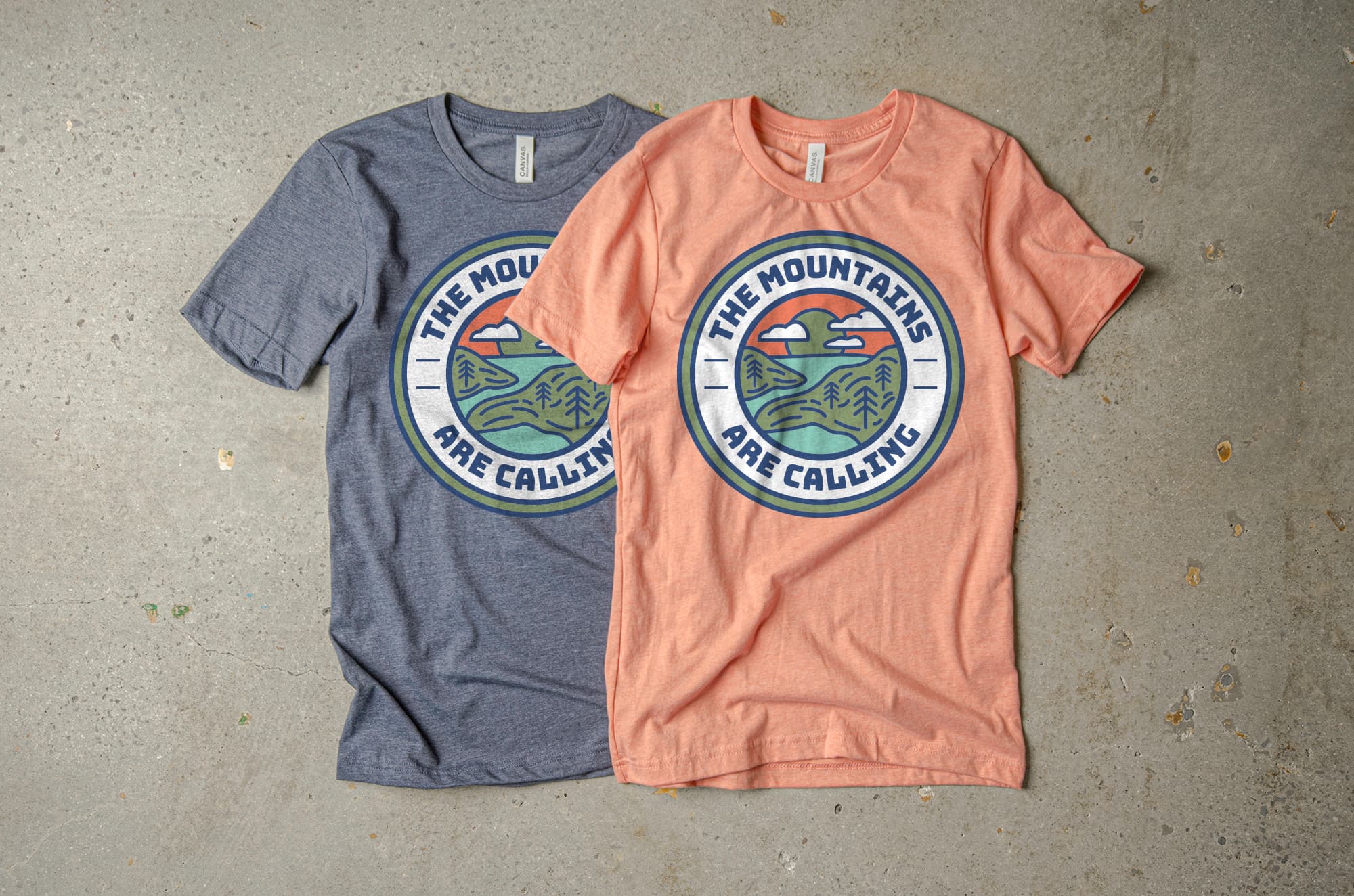
We’ve saved the most difficult for last and tackled a tetratic color scheme in this final t-shirt design example. The four colors make for an ultra-vibrant color pallet that’s perfect for a design that you really want to stand out.
The large amount of color variation gives this t-shirt design a ton of contrast and we’ve picked an example that can embrace it. That’s really the key to these more eccentric color pallets, save them for the times when your design really calls for it. More flamboyant t-shirt designs have their place and picking out a good set of tetratic colors just might be exactly what you need.

You’ll notice that the color pallet feels youthful and exciting. It’s perfect for a kids event where the variety of bright colors will be appreciated and a rainbow of colors will feel at home. We’ve taken this t-shirt design all the way, opting for four colors of similar shade and tone, leaving only the darkest green for the details.
In conclusion
Whether you choose to keep it simple with a monochromatic t-shirt design, or you go with something more exotic, taking the time to consider your color combinations is worth the effort to get something that you’ll be proud to put on.
Applying some basic color theory is often the line between amateur and professional-looking design, and with these simple tips, we’re confident you can take your own t-shirt designs to the next level. Keep up with us for more tips on t-shirt design and let us know if learning a bit more about color theory helped you with your project.