When you see as many t-shirt designs as we have, you pick up on the things that often make or break a design. And one most common mistake is just a poor use of color. This might what colors you pick — or — how you choose to arrange them. But, we want to make the most of every t-shirt we print and show you how you can design professional looking t-shirts yourself with just a little bit of inspiration.
With that, we'd like to introduce you to a series of color palettes made to give you new t-shirt design ideas while we teach you a bit of color theory along the way. And for the overachiever, you can check out our detailed article about how to use color theory to design your shirt.
Today's color palette: Riverside
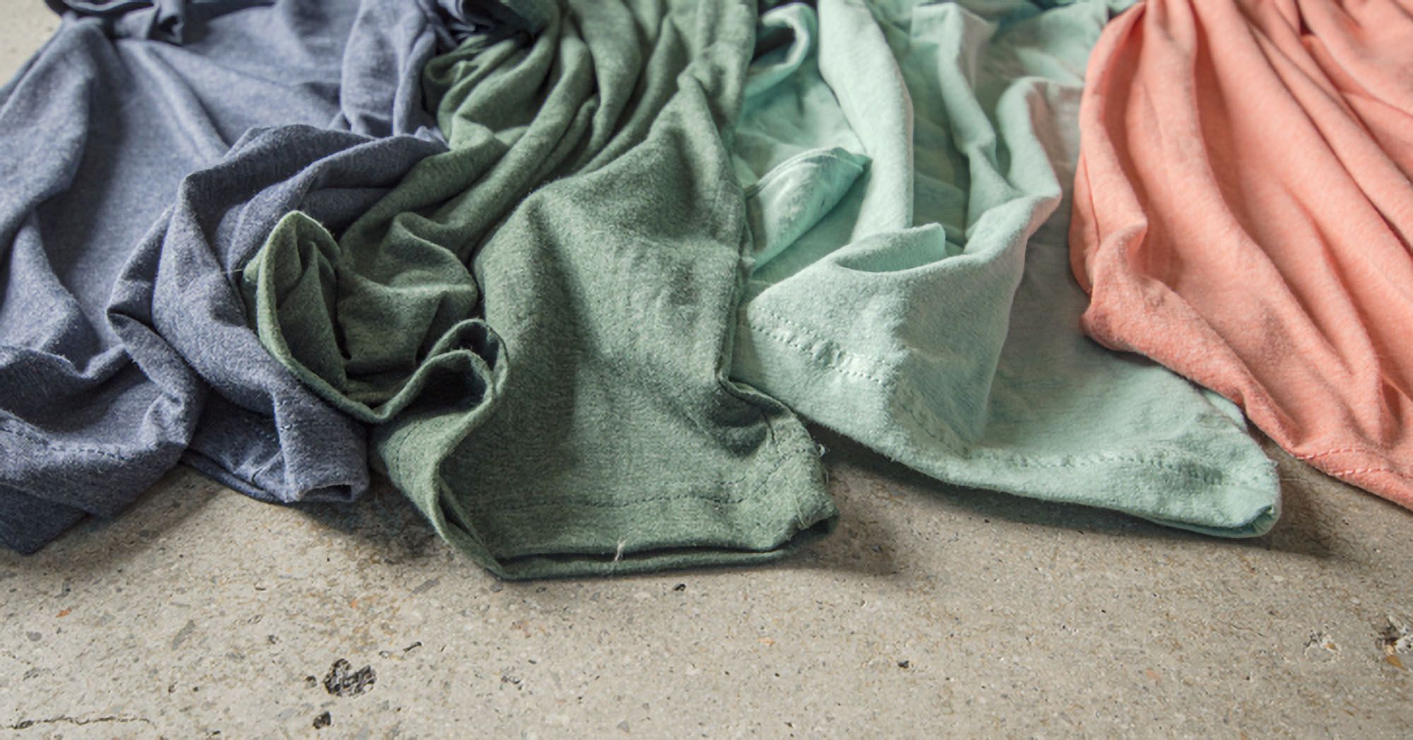
We named this color palette after the soothing and watery earth tones that make it up. A combination of greens, blue, and an accent peachy coral give this color scheme a soft yet punchy feel that's versatile.

Color harmony
To start, this four-color palette is what's called an accented analogous color scheme — wait, a what?
Let's breakdown what all that means.
First, color harmony just refers to why colors look good together, and there are names for the types of color pairings that you can make. In this case, we've started with an analogous color scheme — these are colors that are next to each other on the color wheel.
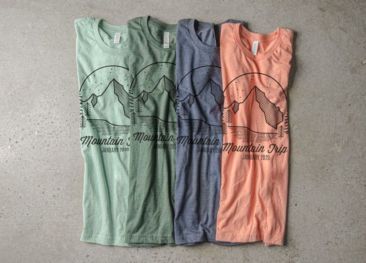
A great use of this color palette is a combination of colors from our Canvas Jersey T-shirts. The colors in this photo are Heather Midnight Navy, Heather Forest, Heather Prism Dusty and Heather Prism Sunset.
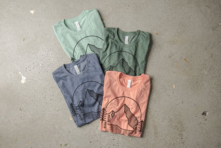
Another way to use this palette is by using the colors in the actual design. Below we have included a few examples of the Riverside color palette used in the t-shirt design.
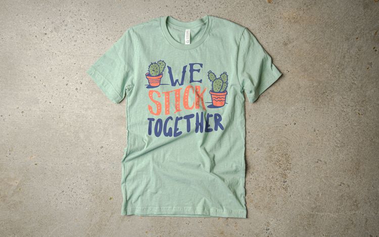
Below is the Canvas Jersey tee is Heather Prism Dusty printed with coral, denim and moss ink from the UberPrints design studio.
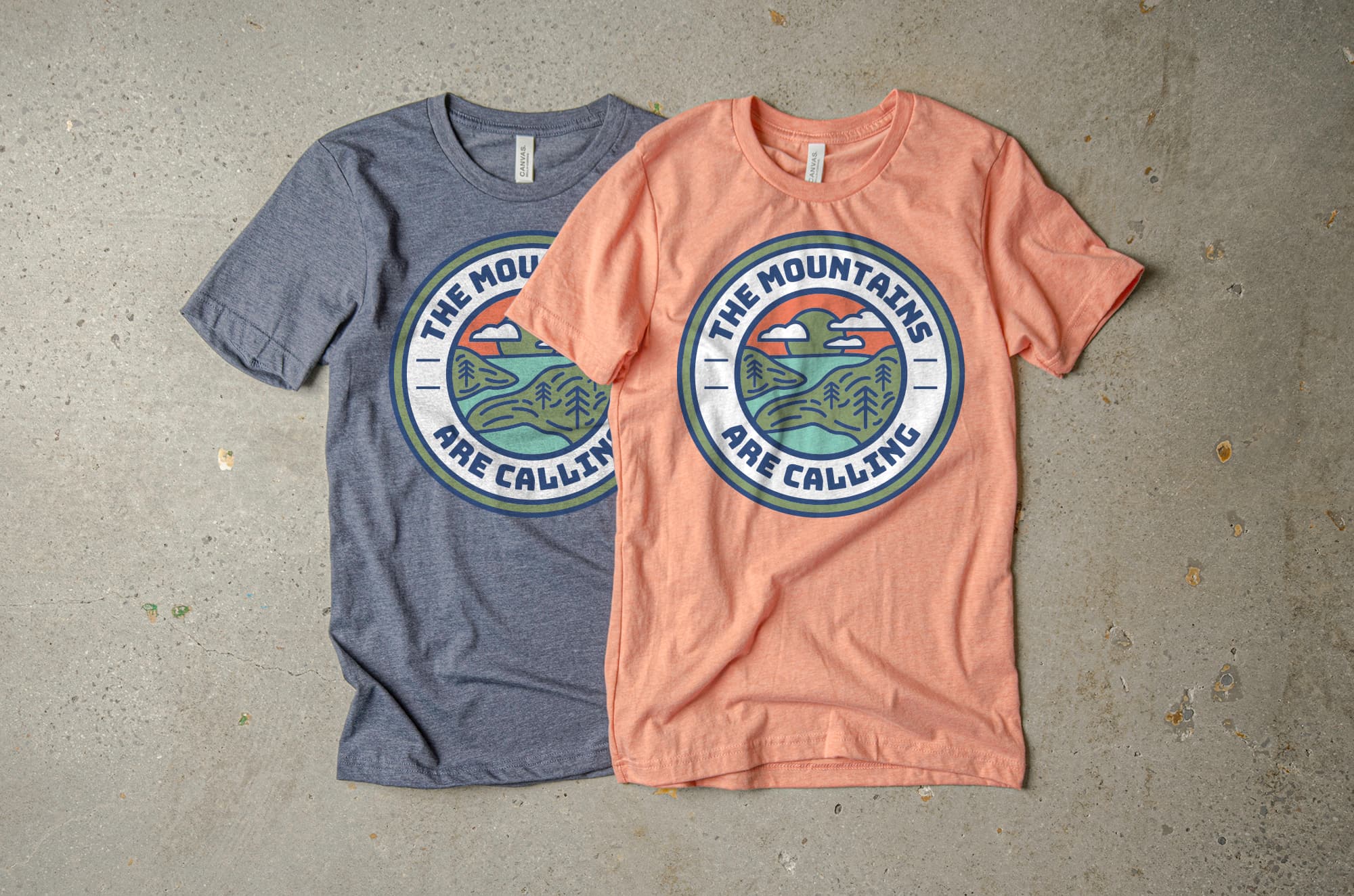
Next we have included the Heather Midnight Navy and Heather Prism Sunset with Moss, Coral, Denim, Oasis and White ink.
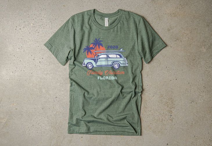
Our last example is the Canvas Jersey Heather Forest with Denim, Oasis, Coral and White ink.
Point is, once you find the right color palette for your project there are numerous ways to use it. To get started, check out our T-Shirt Color Palette Inspiration posts and see which color palette best matches your t-shirt needs. From there, get creative and play around with your colors until you find the right combination that works for your design. We have tons of inspiration to help you through the process.
