

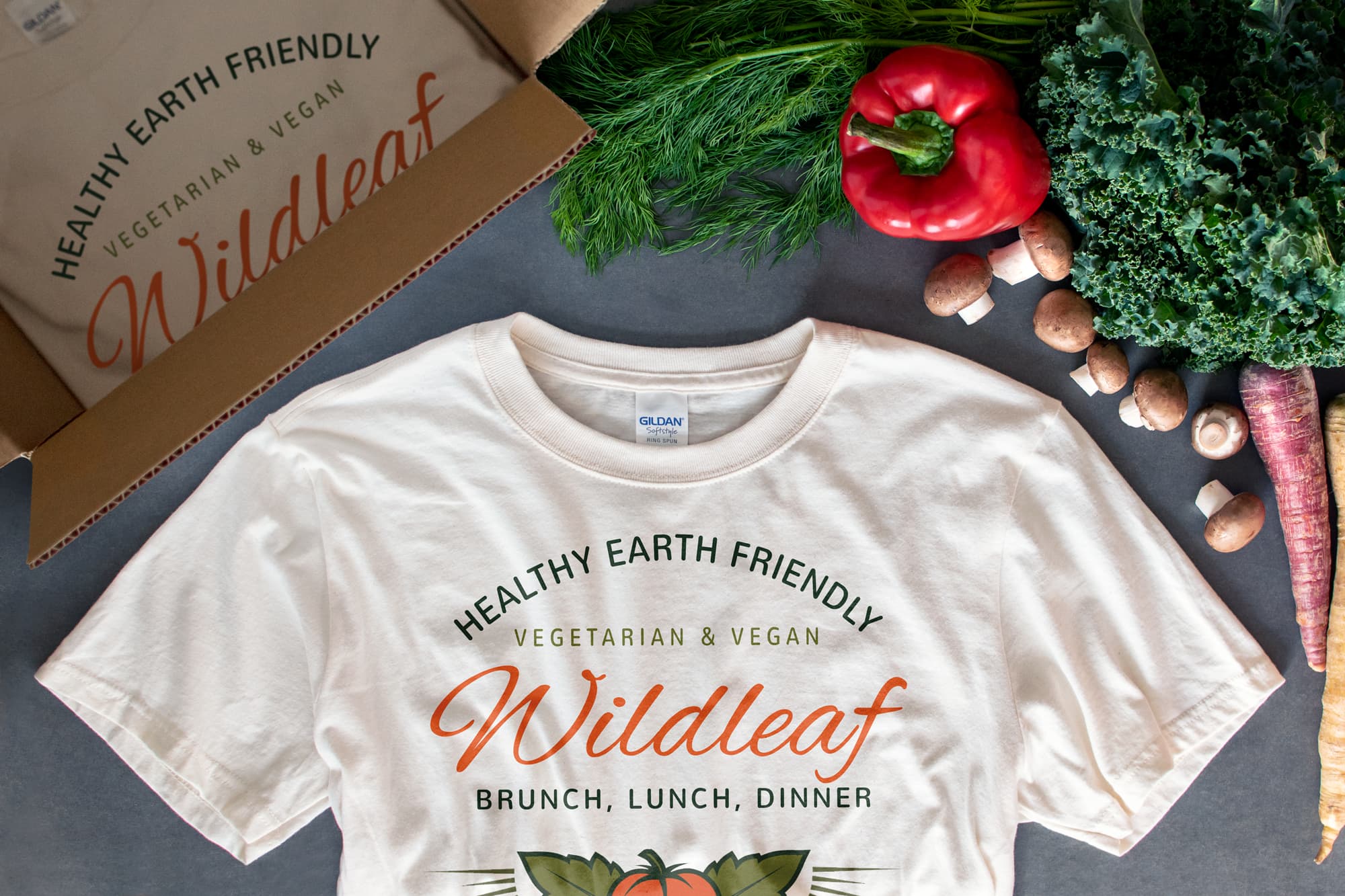
If you’ve ever had a tough time designing your own t-shirt, know that it doesn’t have to be that difficult. We really believe it’s possible for anyone to make professional-looking t-shirts. Because that’s what’s at the heart of our mission here at UberPrints — to give everyone the confidence to make something they’re proud of.
A few ways we make that possible is by building effortless design tools and curating our site with today’s trends. But it’s also important to provide in-depth resources when you need them, especially if you’re not all too familiar with the kinds of things that make t-shirt designing unique.
So for those that could use a deeper explanation, I’ve put together a t-shirt focused design lesson that describes how basic principles are used to create the best looking custom t-shirts.
Whether this is your first time designing anything, or you’re just new to the realm of t-shirts, these tips will show you how to design a t-shirt that meets your needs, makes printing simpler and more cost effective, and looks awesome all at the same time.
You can always jump right into our Design Studio and immediately start experimenting — or rely on one of our t-shirt design templates to get you started. But, if you take the time to understand these principles, you’ll feel more confident customizing and making it your own.
How to get started
Getting started is often the most difficult part. Staring with a blank canvas can be intimidating and is precisely why we’ve worked to offer so many design templates to get you going. But before you start trying to put together different elements, it’s important to reflect on what you’re trying to accomplish with your t-shirts and how you’d like the end result to look.
Consider the purpose and end use of your t-shirts. For example, businesses will likely have different priorities and goals than a family vacation, let’s say. Knowing whether your t-shirts are intended for an event, as merchandise, as a uniform, or any other purpose, will help guide the look and how you prioritize costs.
Get some inspiration and decide on the look you’re going for. You want to have an idea of the kind of look you’re going for — whether that’s bold and bright, or vintage and worn, intricate and elegant, or modern and graphic. You can of course use our design templates as a source of inspiration, but really, anything will work. Just having some other examples that you like to reference will go a long way.
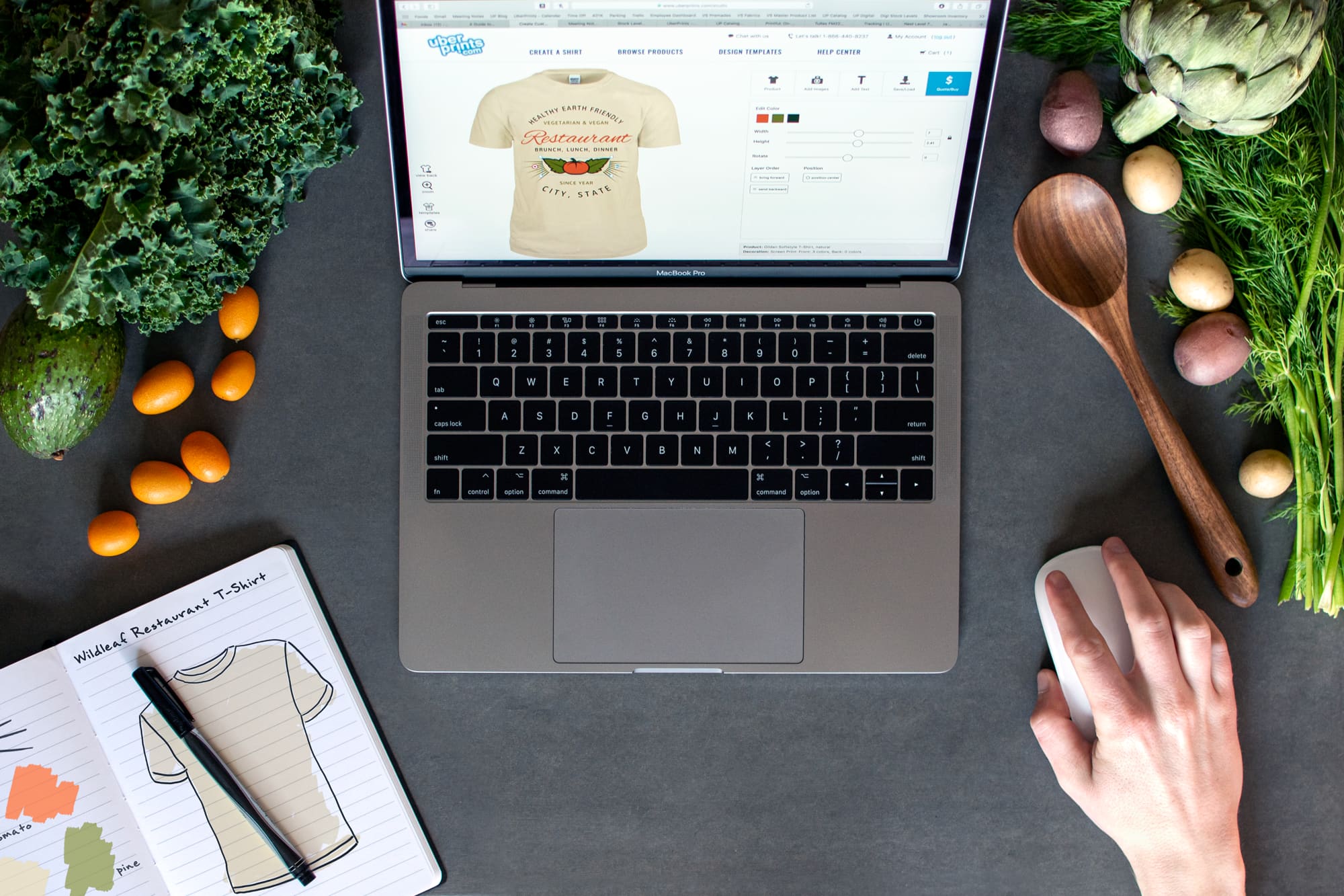
Once you have an idea for the direction of your design, you can start playing around with different elements and colors. The design-savvy might like to use advanced tools like Photoshop and Illustrator, but quick and easy designing is exactly what the Design Studio is made for. Add and customize images from a library of clip art, add text with tons of different fonts, and upload your own images, all in one place.
And to show you how to combine and arrange all these different elements, we’ll explore how to use typography, create a color palette, understand composition, and how to place your design and consider the garment you're designing on.
Where to place your t-shirt design
Discussing this might seem a little unnecessary, but the scale and placement of your design plays a large role in defining the overall look of your t-shirt. Not to mention the fact that the garment itself may dictate the size and location of the design.
Here are a few examples to demonstrate how arranging and placing your design in different ways will affect the vibe of your t-shirts.
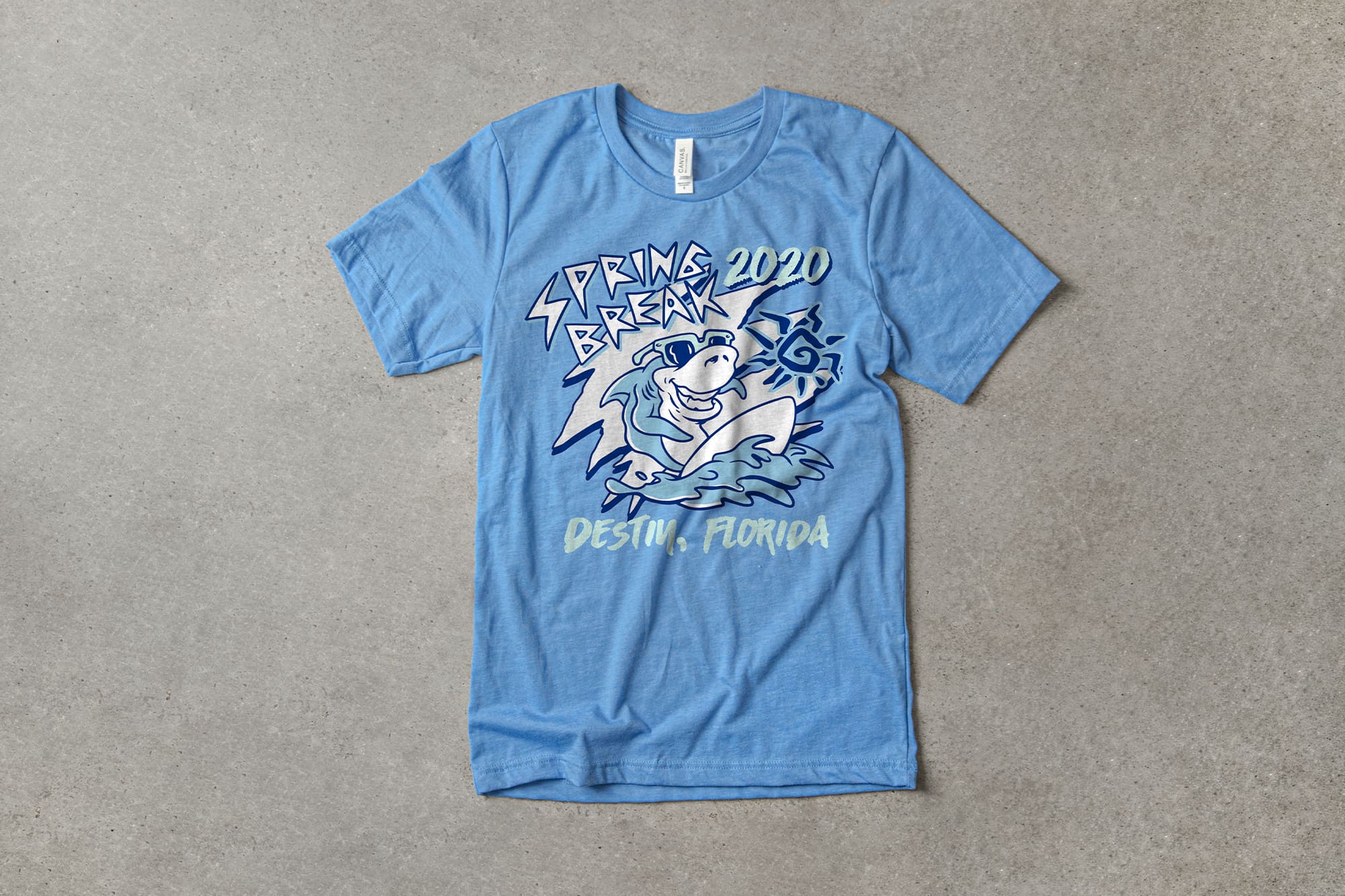
Across chest promotional designs - T-shirt designs that concentrate their attention on a single, bold statement printed across the chest have a particular kind of impact. Companies often design promotional t-shirts this way because it advertises their name and uses the wearer like a billboard. It’s simple, to the point, and works well to broadcast your brand, name, or logo.
Left-chest and full back designs - Left-chest (or the much less common right-chest) designs are often used to brand apparel with a logo and are paired with a full back print that’s more detailed and elaborate to complete the overall look. This combination gives the design a more official feel and is really popular for Greek t-shirts, apparel brands, staff uniforms, and others.
Decorative full-front designs - Designing for the entire front of a t-shirt gives you a whole lot of real estate for more elaborate prints. These are often more artful and really take advantage of the t-shirt like a canvas. Not to say this isn't a good approach for something like a business, in fact, it's a great way to give your t-shirts the look of retail quality.
There are, of course, many ways you can arrange and place designs on a t-shirt, but I point out these examples because they show how you’re already used to seeing some of these common styles, and that they convey a certain kind of image, both for the designer and the wearer.
Also, knowing whether you’re designing for a left-chest or a full back, for example, will inform the way you arrange elements and the scale you’ll be designing at. Planning this overall arrangement first will make the following steps easier.
Here are some tips for placing your design:
Don’t place your design too low. The vertical center of a t-shirt is around sternum height — the chest, roughly. Avoid the mistake of placing it directly between the collar and the bottom hem because it will absolutely look too low.
Center your design visually. If your design includes elements that extend off to one side, it’s likely best to center the design based on the visual center instead of between the edges.
Consider the space allowed by the garment you’re designing on. The style of garment may have size limitations that you want to stay within. Pocket t-shirts are a good example — which only have so much space to print directly on the pocket. Hoodies also, which have limited vertical space above the pouch pocket.
Bigger isn’t always better. Sometimes you really want to fill the printable area, but many times, bigger can actually look kind of awkward, especially once you’re wearing it. Some logos and graphics just need more space around them to breathe.
When designing 2 print locations, vary the scale and detail. There’s a reason why a small left chest print goes well with an elaborate full back print. The contrast between the two print locations is a good way to have some asymmetrical balance in your overall look. A front and back with huge, highly intricate designs can sometimes look too intense. And for goodness’ sake, don’t just duplicate the exact same thing on front and back.
How to design a t-shirt with an effective composition
In terms of art and design, composition is the way in which different elements are arranged relative to each other and the canvas they’re on. In our case, that canvas is a t-shirt — and being that t-shirts aren’t exactly a rectangle — the way you should approach arranging your composition is affected by the irregular shape of the garment and the way it’s worn.
All good compositions have 2 things, balance and hierarchy. Balance is exactly what it sounds like, it’s arranging elements in a way that’s not too lopsided or heavy on one side. And hierarchy is the order of importance each element has to the overall design. For example, important text like a business name should be large and stand out, while decorative elements or secondary text should be smaller and less prominent.
Typically, when you design on a rectangular canvas, the straight edges frame all the elements creating a bounding box to design within. T-shirts are very different because not only are they a more complex shape, but they’re also a 3-dimensional object that’s formed by the body underneath it. So to help you arrange your design, you can create your own bounding box that will help you keep things looking balanced.
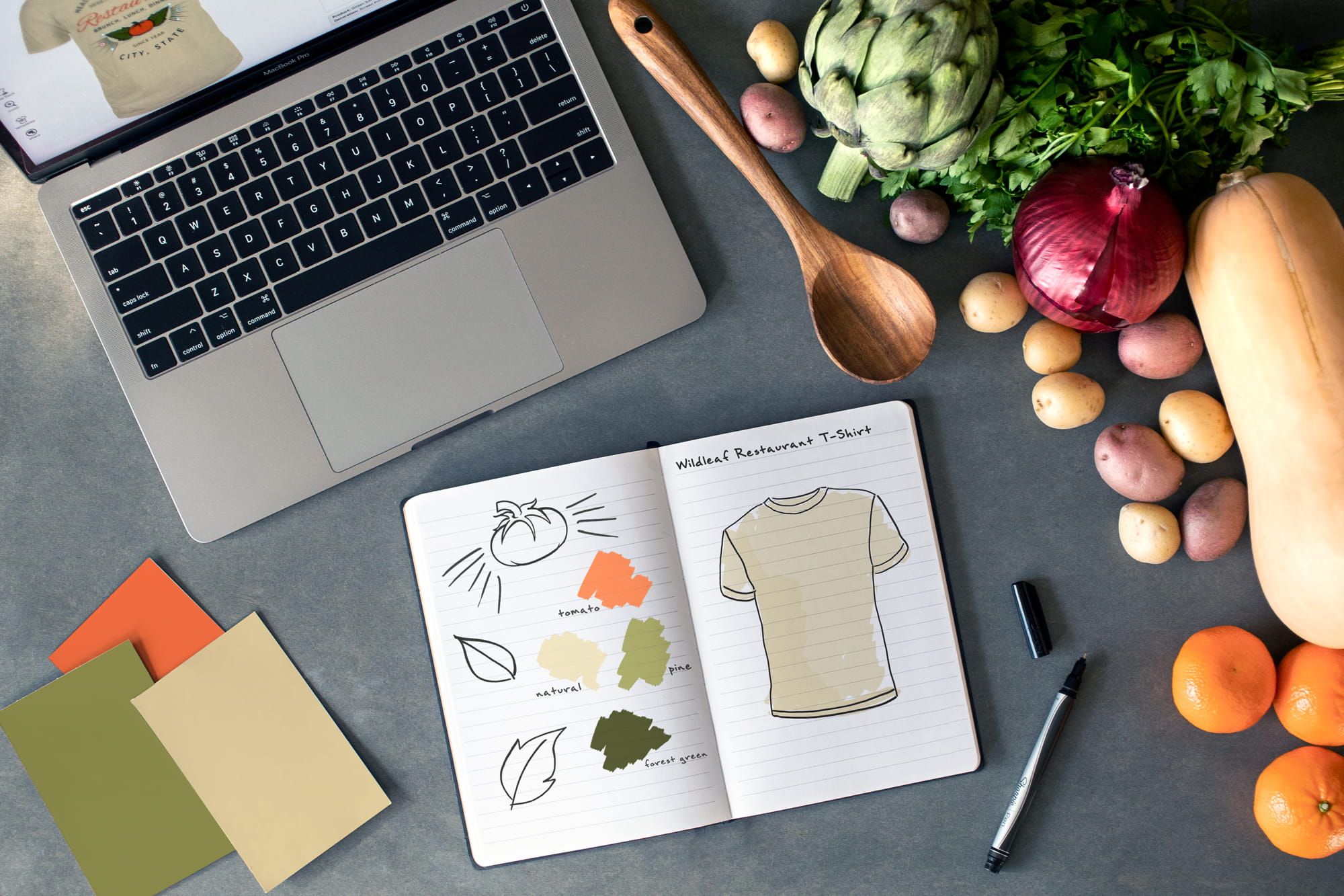
So, what in the world am I talking about? Well, you’re actually used to seeing t-shirt designs that use this approach and it’s one of the reasons why designs made for t-shirts often have a certain look. One simple way to do this is to use a background shape that frames all your design elements. Let’s break down a design to show you what I mean.
Using background shapes
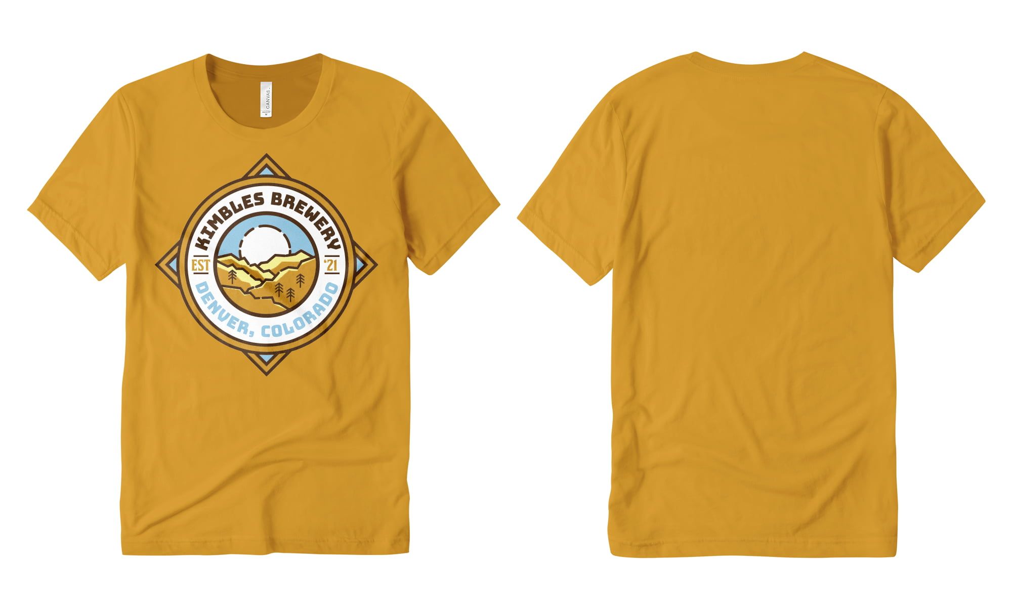
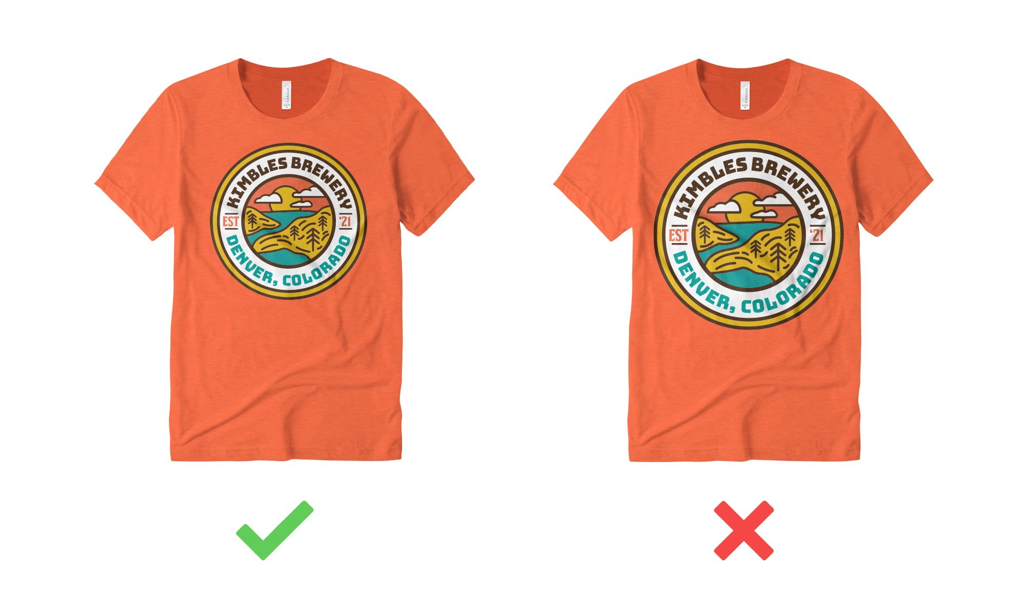
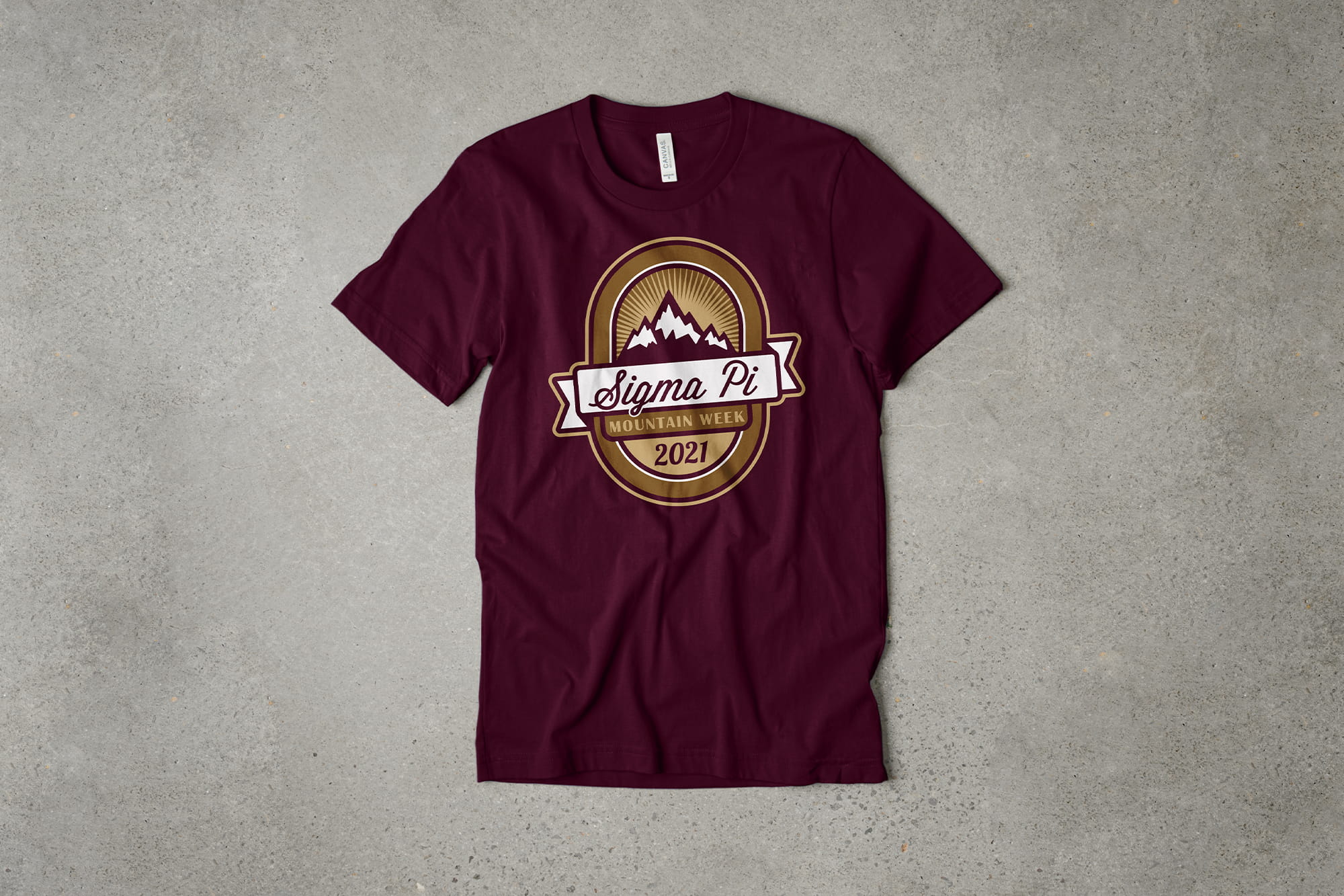
The design below is a template from our brewery category and shows exactly how using simple background shapes help you make sense of the composition and give all the elements a place to sit.
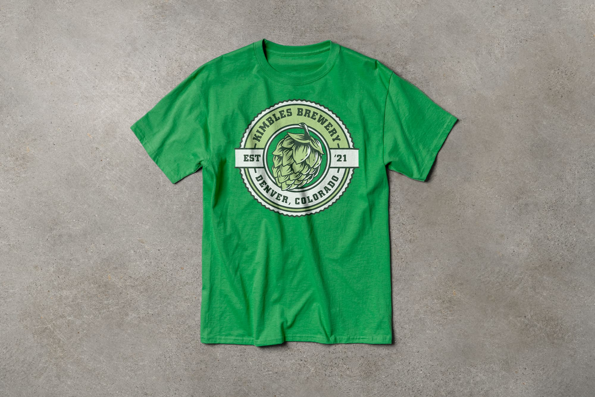
When you’re trying to arrange a few text elements, in this case a business name, location, and year, just placing them every which way on a blank t-shirt can make everything feel like it’s floating. This background circle shape fixes that problem by giving designated spots for each of these text elements to sit, and it provides a nice bounding box for the print.
It also adds interest and decoration to the design in a clean and simple way. Often, people begin their design knowing what text information they want to include, but don’t realize how important a few geometric shapes are to making the design feel complete. This design is actually really simple. It's built with just a few text elements, a single piece of clip art, and some circles and straight lines to ground and arrange everything.
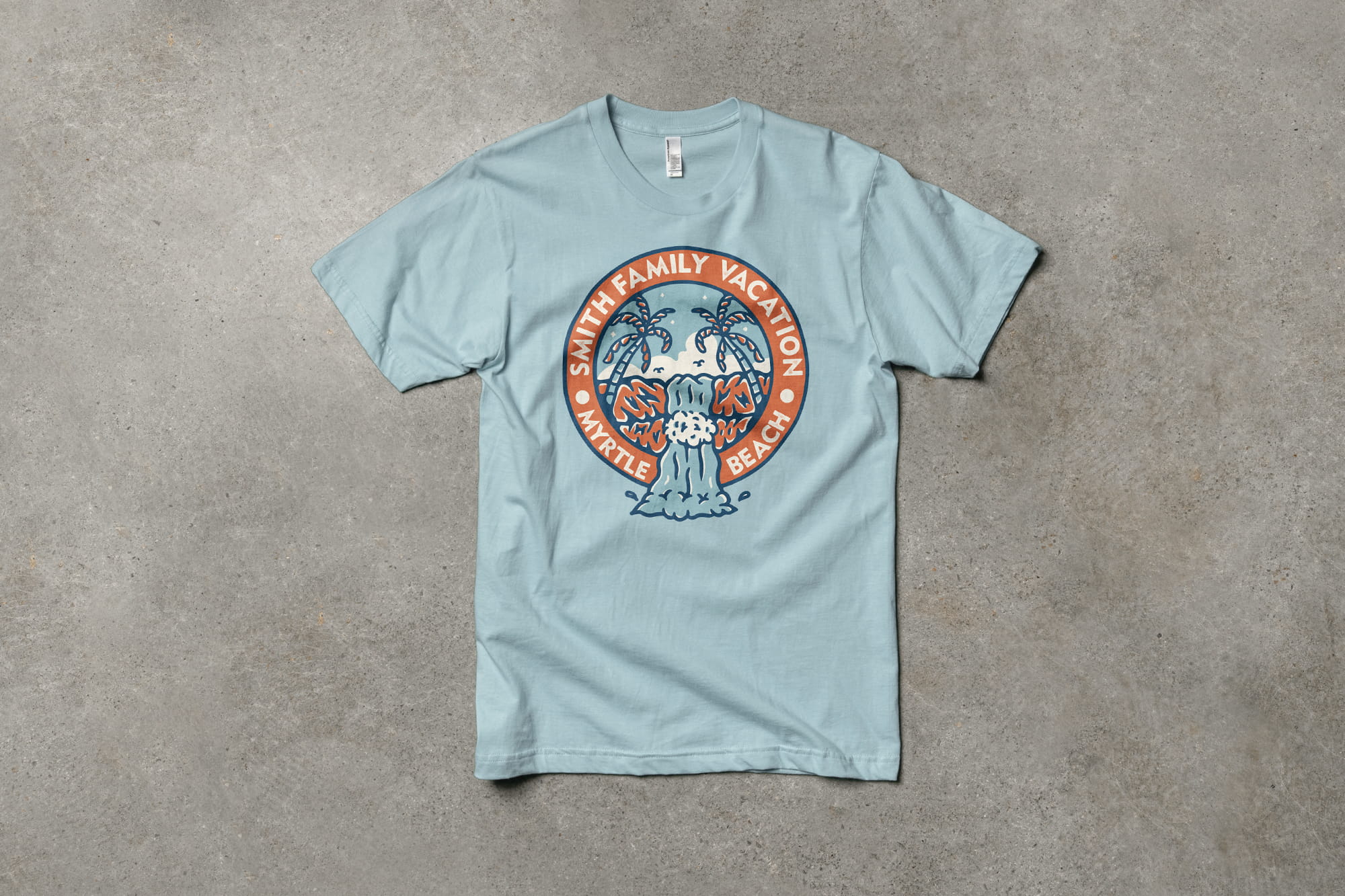
Containing the elements in a large shape like this is really common and isn’t limited to just circular shapes. The design below is from our family vacation templates and is essentially made the same way.
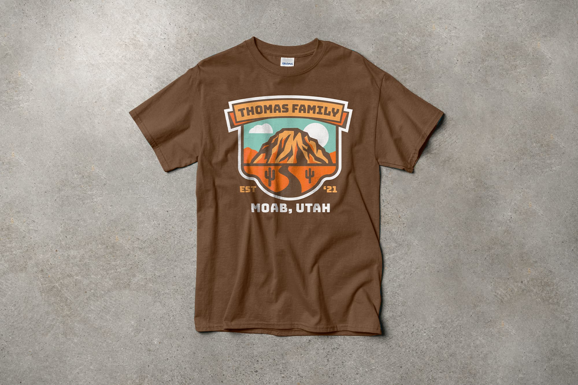
The banner at the top highlights the most important text and gives it a box to sit in. And the illustration in the center is given an outline like a window so that each object, like the mountains, cacti and such, aren’t just floating around the t-shirt. What’s a little different here is that not everything needs to fit within this window.
The text at the bottom of the design mirrors the text at the top so it still feels balanced. And the other small text elements conveniently fit in the negative space left by the window shape. You can still imagine an invisible rectangular bounding box on the front of the shirt that’s grouping all these elements together so they don’t feel haphazardly placed.
Stacking elements and visual hierarchy
You don’t have to always use a shape that contains the design elements to make the composition look good. Instead, stacking and grouping elements can accomplish the same thing while conveying the importance of each element.
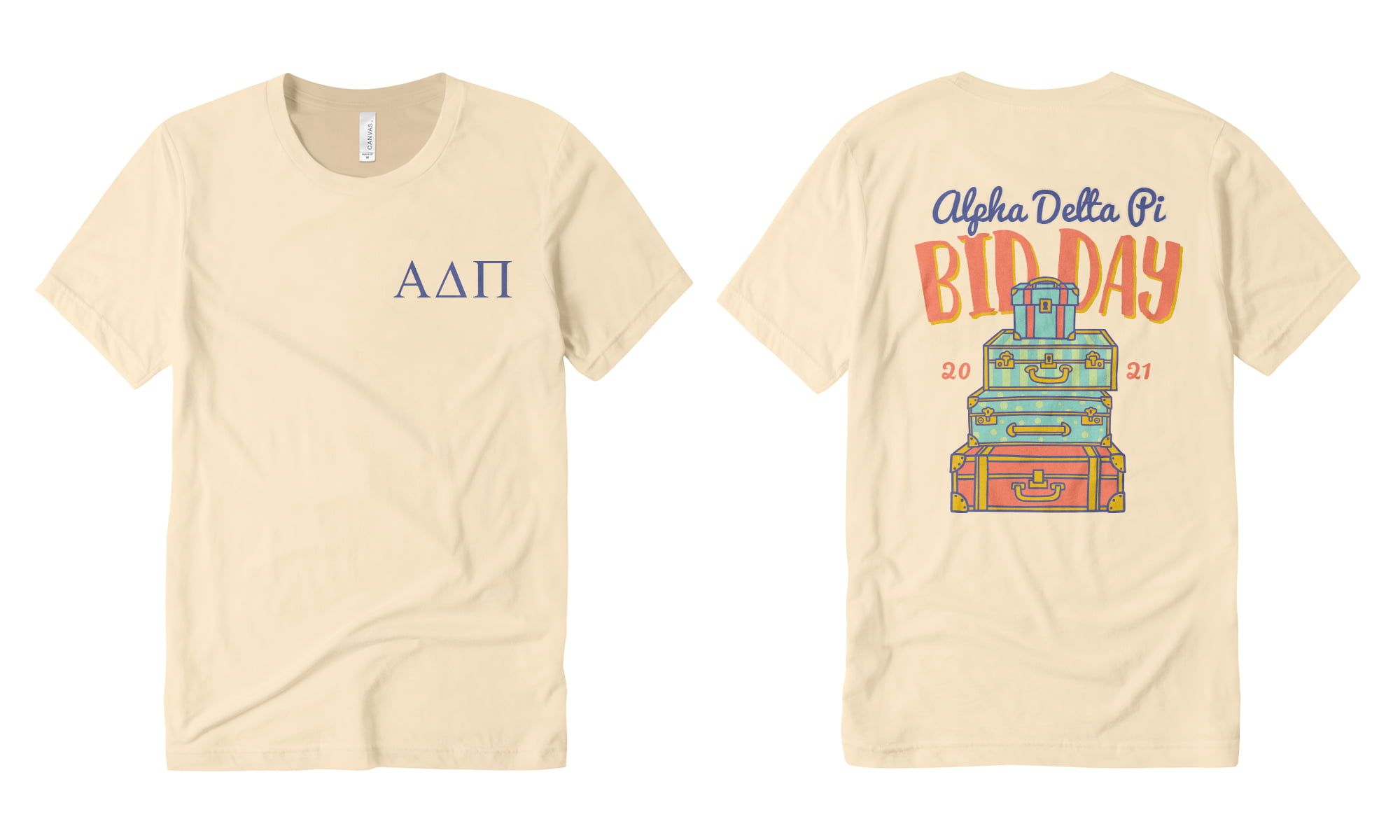
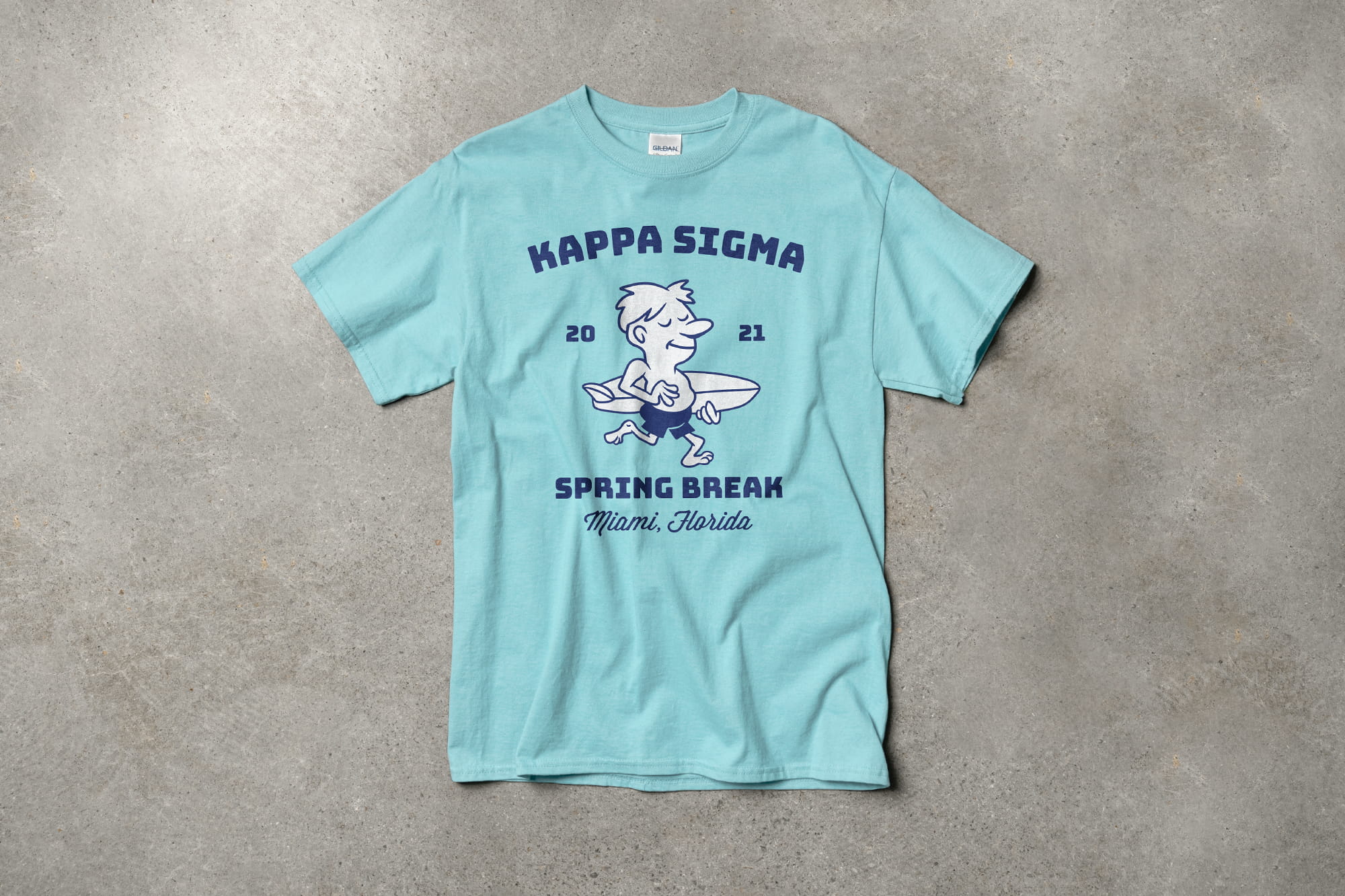
The design below is from our greek design templates and demonstrates how stacking just a few elements can create a design that’s not just balanced, but also has a clear hierarchy that creates a focal point.
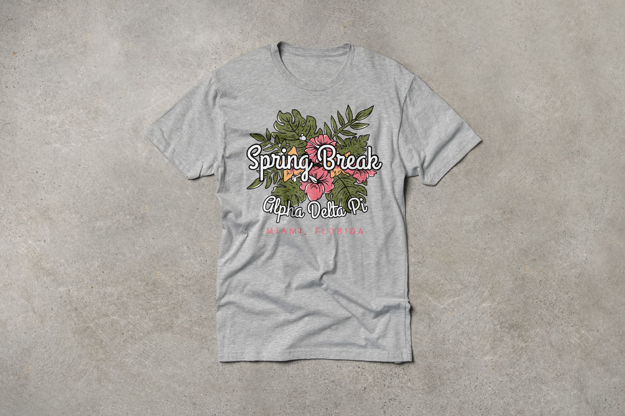
The decorative floral illustration in the background works the same way as the geometric shapes in the previous examples. It frames the text elements that are stacked on top so they aren’t floating and you can imagine the bounding box all these elements are grouped within.
Also, each element is sized and designed in a way that makes it clear which is most important. The large, bold text is clearly the most important and is placed at the visual center of the t-shirt. The secondary text elements are then either smaller, or a color that doesn’t stand out as much against the t-shirt, and are placed lower, away from the center.
Here are some general tips for how to design a balanced t-shirt with a clear focal point:
Symmetrical designs are a good go-to. Your design can still feel balanced even if it’s not symmetrical, but it definitely simplifies things and always looks good on a t-shirt.
Create a primary focal point with scale and placement. The most important element in your design should stand out over the others and is best placed on the chest, or whatever the visual center is for that location. And make sure other elements are clearly secondary.
Don’t make it too complicated. The more elements you add to your design, the more difficult it will be to arrange them effectively. The best designs are often the simplest and adding too many elements can make it feel cluttered and without a clear focal point.
The smaller the design, the simpler it should be. If you’re designing for something as small as a left-chest, you’ll have less room to fit multiple elements. That’s why small locations like this are usually just logos or names. Trying to fit too much in a small space can make the design illegible, not to mention difficult or even impossible to print.
How to design a shirt with a strong color palette
The color palette you choose will have a big impact on the style of your design and the relationship between the different elements that make it up. To know how best to create your color palette, it helps to know just a bit about color theory and how it applies to t-shirts.
Color theory is the study of the relationships and effects of color. These bullet points will give you a crash course in using color effectively:
Colors are either warm or cool. Warm colors are reds, yellows, and oranges. Cool colors are greens, blues, and purples. Warm colors convey things like excitement, joy, or anger. Cool colors convey things like calm, relaxation, or sadness.
Combine dissimilar colors to create contrast, or similar colors for less contrast. Pairing a warm color with a cool color creates much more contrast than 2 warm colors. You can do the same with light and dark, or dull and vibrant. Draw attention to certain elements by heightening contrast, and decrease contrast in less significant elements.
Color palettes are named by the relationship between the colors. Complementary colors are opposites, like blue and orange. Analogous colors are adjacent to each other, like orange and red. Monochromatic colors are just different shades, like light and dark green. Stick to just one of these color schemes to make everything feel harmonious.
Colors and printing cost
One more important thing to note before we delve deeper into colors, is the way it can affect printing cost. Screen printed t-shirts factor in the number of colors in a design to determine the print cost. And that’s just because with screen printing, individual mesh screens have to be made and printed for each color.
Alternatively, digital printing, also called direct-to-garment printing, does not factor in the number of colors. Digital printing is a form of inkjet printing that works more like your desktop printer at home. We offer both options but there are a few reasons beyond just color for why you should choose one print method over the other.
Just keep this in mind while you’re designing and know that if you’re trying to save money on a screen printed order, keep your color count to a minimum.
Leveraging the t-shirt color in your design
There are a few ways you can strategically use color in your t-shirt designs to make them look better or even save some money. And one thing that makes t-shirt designing unique is that you have to coordinate with the color of the t-shirt itself, but there are interesting ways you can do this.
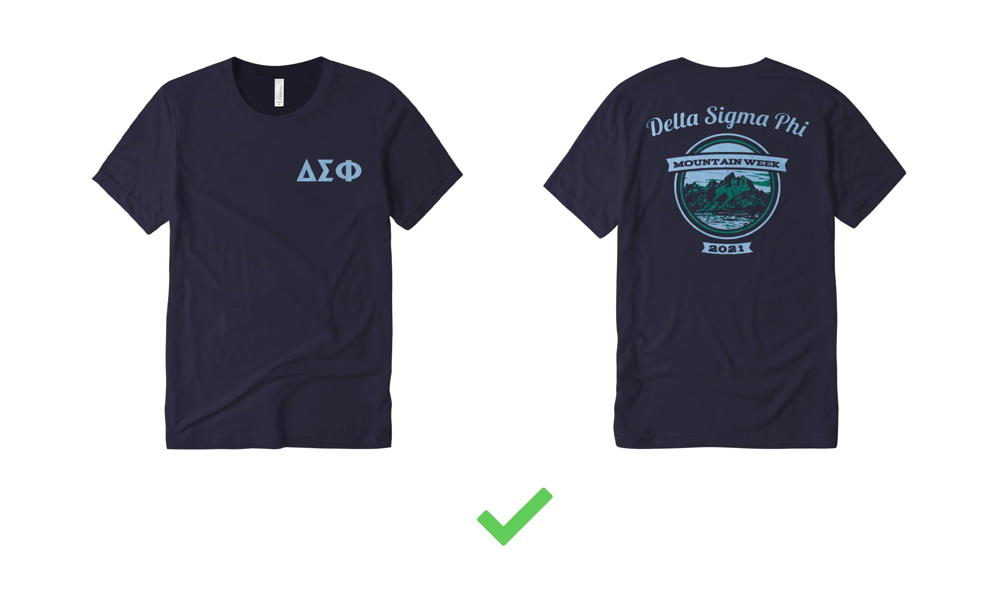
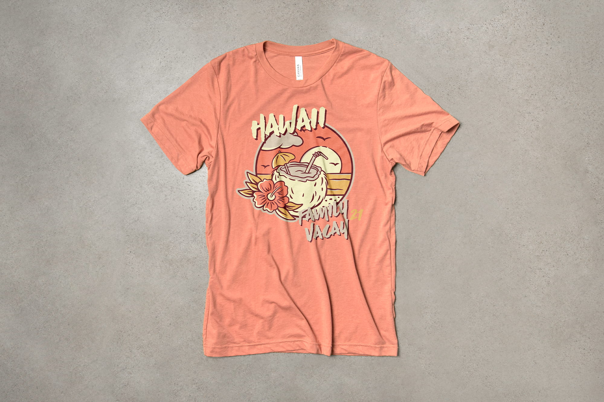
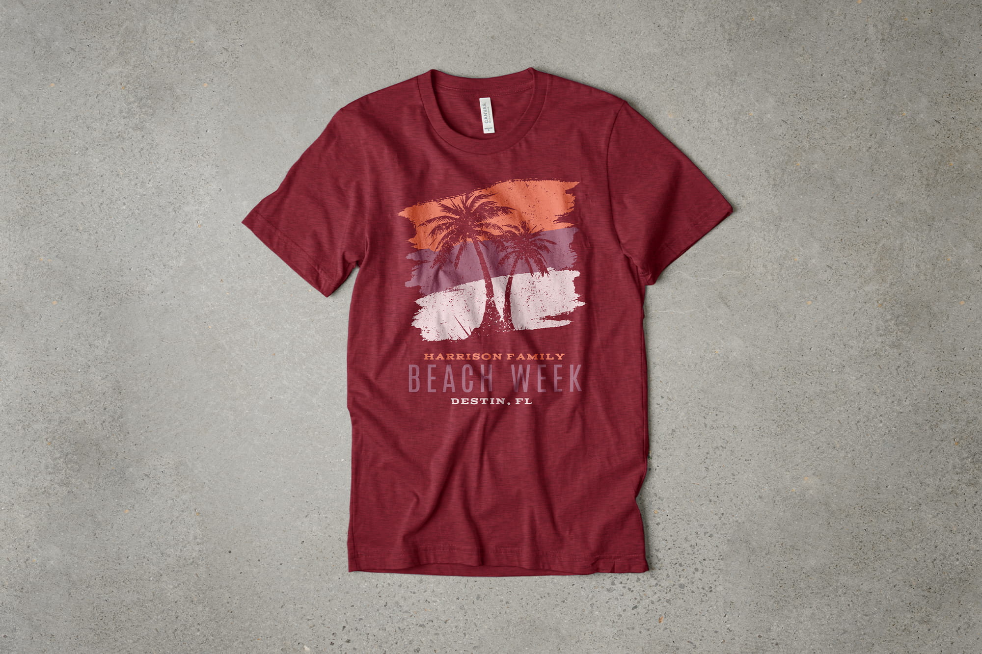
One way is to use the shirt color as positive space in your design. This means making elements in the foreground of your design transparent, allowing the fabric to show through. The design below is from our fraternity design templates and exemplifies this tactic.
The primary text element and mountain illustration are made transparent to use the fabric color. This gives the impression of a design with more colors than it actually has so that you can achieve the same look but with a lower printing cost. But there’s also another reason why this works particularly well in this example.
Because the shirt color is the darkest in the palette, and it’s put right next to the lightest color, it creates an area of high contrast for the main focal point. The other secondary elements are lower contrast which helps give the whole design a clear hierarchy.
Here are some tips to help you design a t-shirt that uses color more effectively:
Monochromatic and analogous color schemes are the easiest to control. When you limit the colors you include in your design, elements are less likely to clash with each other and it often makes a more modern-looking design.
Pick colors with enough contrast. If you’re using multiple colors, you most likely want to use a full spectrum from light to dark so that elements are distinguishable.
Consider where the t-shirt color fits in your palette. It’s common to make the shirt color the darkest in your palette, but you can even make it a mid-tone and pair it with darker and lighter ink colors.
Use the most contrast for your focal point. You can do this by using opposing light and dark colors, but also by contrasting warm and cool colors as well.
Using typography to design a t-shirt
Text and typography is a huge part of t-shirt designing. Of course, there are plenty of designers that are focused on making things solely out of artistic illustrations. But the vast majority of the t-shirts we print every year have text as an integral part of the design.
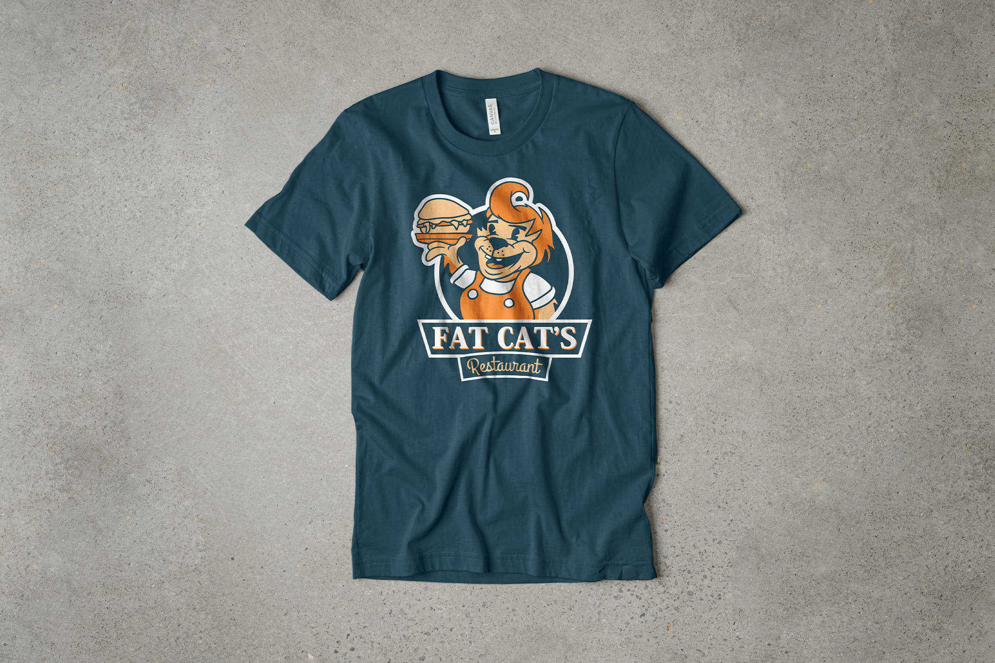
In the same way that color and arrangement are used to create balance and contrast, typography too is an effective way to create a focal point. The example below from our business design templates uses lots of text elements that are differentiated by their typography styles and color.
When trying to fit a ton of text information in your design, you should decide which element is most important, in this case the restaurant name, and set it apart from the rest of the text elements with a contrasting font style. Pairing font styles like this is important because it not only adds more visual interest, but also helps show a clear hierarchy of information that will make your design instantly legible.
The design uses a decorative script font called Alex Brush for the primary text, and contrasts it against the other elements using a sans-serif font called Nunito. Contrasting but complimentary typefaces are a good go-to when you have multiple text elements you need to organize.
In addition to contrasting typefaces, it uses color, placement, and scale to reinforce the way each element is organized. The warm tomato color is the highlight that contrasts against the complementary green colors, drawing your attention to those elements first. It also helps to arrange these elements with the largest focal point across the center of the chest, and the rest of the smaller ones filling out and framing the composition.
Here are a few tips for using typography in your own t-shirt designs:
Legibility is the most important thing. Make sure to pick a font that isn’t so decorative that it’s hard to read and scale it appropriately to make sure it’s not too small.
Contrast font styles to show what’s important and make it interesting. If you have multiple text elements, you almost always want to use more than one font style. Contrasting typefaces are great for creating a focal point and interest, but even just making one of them bold might do the trick.
Match the fonts you use with the design style you’re going for. The font you use is one of the most important things that gives your design its style. Elegant script fonts convey a very different message than bold collegiate fonts.
Stick to just 2 different font styles. Trying to pair too many different fonts in a single design can make it feel disorganized without a clear style. Most of the time, just pick 2 that will complement each other and use color, scale, and placement to distinguish elements.
Play around with arc and rotation. Sometimes arcing the text or rotating it a bit will make the composition more interesting. Just be careful not to take it too far and hurt your design's legibility.
Key takeaways for how to design a t-shirt
Designing a t-shirt can definitely be difficult, but it doesn’t have to be. There’s a lot of information here, but following a few key principles can help make your design look professional without a ton of extra effort. And I’d absolutely still recommend starting with one of our t-shirt design templates if for nothing more than to give you the building blocks of your design. Using a template still gives you all the customization options and flexibility you would have starting from scratch.
Here are the final key tips for making better, more professional t-shirt designs:
- Start by thinking about the purpose of your t-shirts and the look you’re going for. Different people and uses will likely have different priorities for their t-shirts. Look for examples as inspiration for the look and style you’re going for.
- The style of garment and the location of your design are important. How you place and arrange your design will dictate the overall look and certain garments may have more or less space to fit your design.
- Create an effective composition within the t-shirt. Group design elements so that they feel balanced and there’s a clear focal point. Take into consideration what’s most important and the scale your designing for.
- Use color strategically to create emphasis and style. The color palette you use will dictate the mood of your design and you should selectively use color to draw attention to the most important parts.
- Select fonts that are interesting, convey your style, and are legible. Pairing just a couple complementary font styles will go a long way and just make sure the color and size of text elements makes them legible.