Live events are back.
It's no secret live events suffered last year. Especially community festivals featuring food as a major draw—AKA half of why people attend Chomp & Stomp. The bluegrass festival with a chili contest has been the sole fundraiser for the Cabbagetown Initiative Community Development Corporation, the non-profit responsible for public community spaces in the Cabbagetown neighborhood of Atlanta.
Another big revenue driver for the festival was the 5k walk/run. Something else snuffed out thanks to a once-in-a-lifetime-global pandemic.
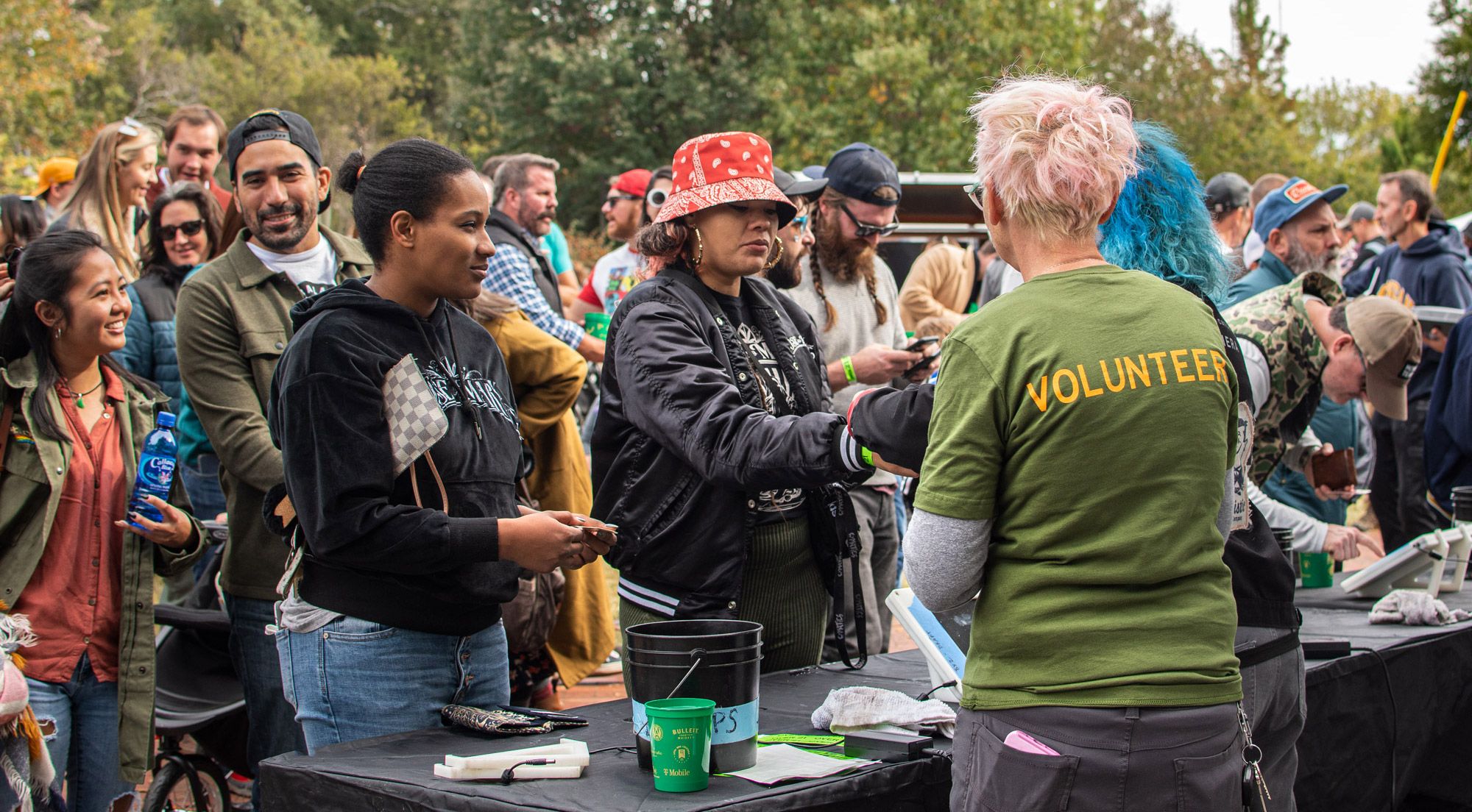
All aspects of the event—contest judges, volunteers, runners, attendees—require shirts. This year, the event organizers went big to make up for lost time.
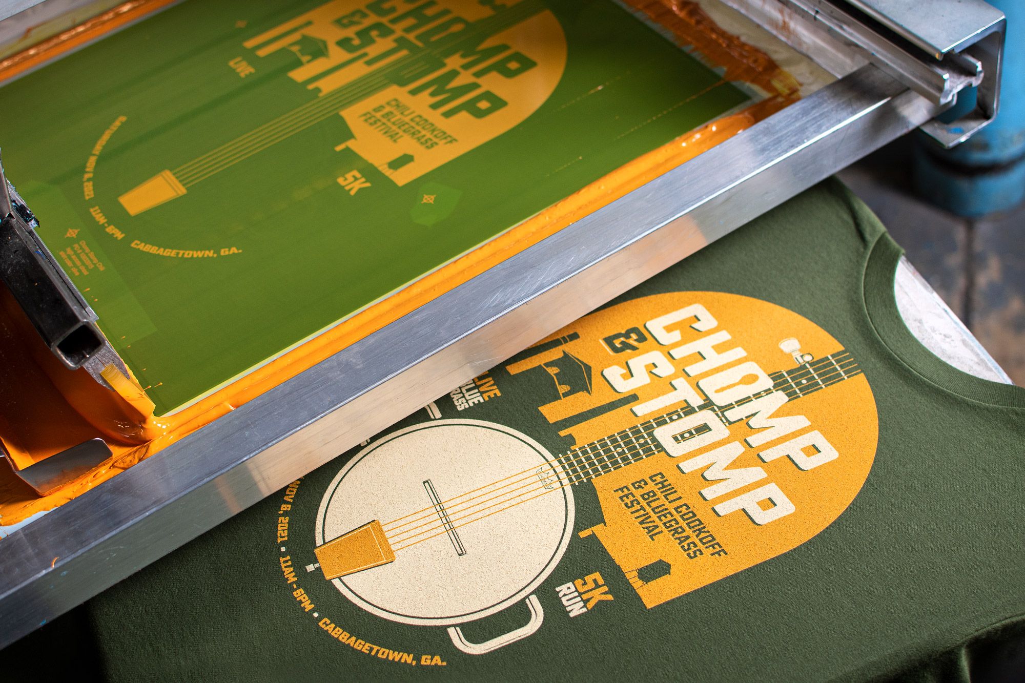
With a lot at stake, organizers chose UberPrints to print large bulk quantities of customized shirts. With 405 shirts needed for all events, organizers depended on UberPrints to be fast on the turnaround times and be top-notch quality so sales can make up for a lost year.
Events like no other call for designs like no other
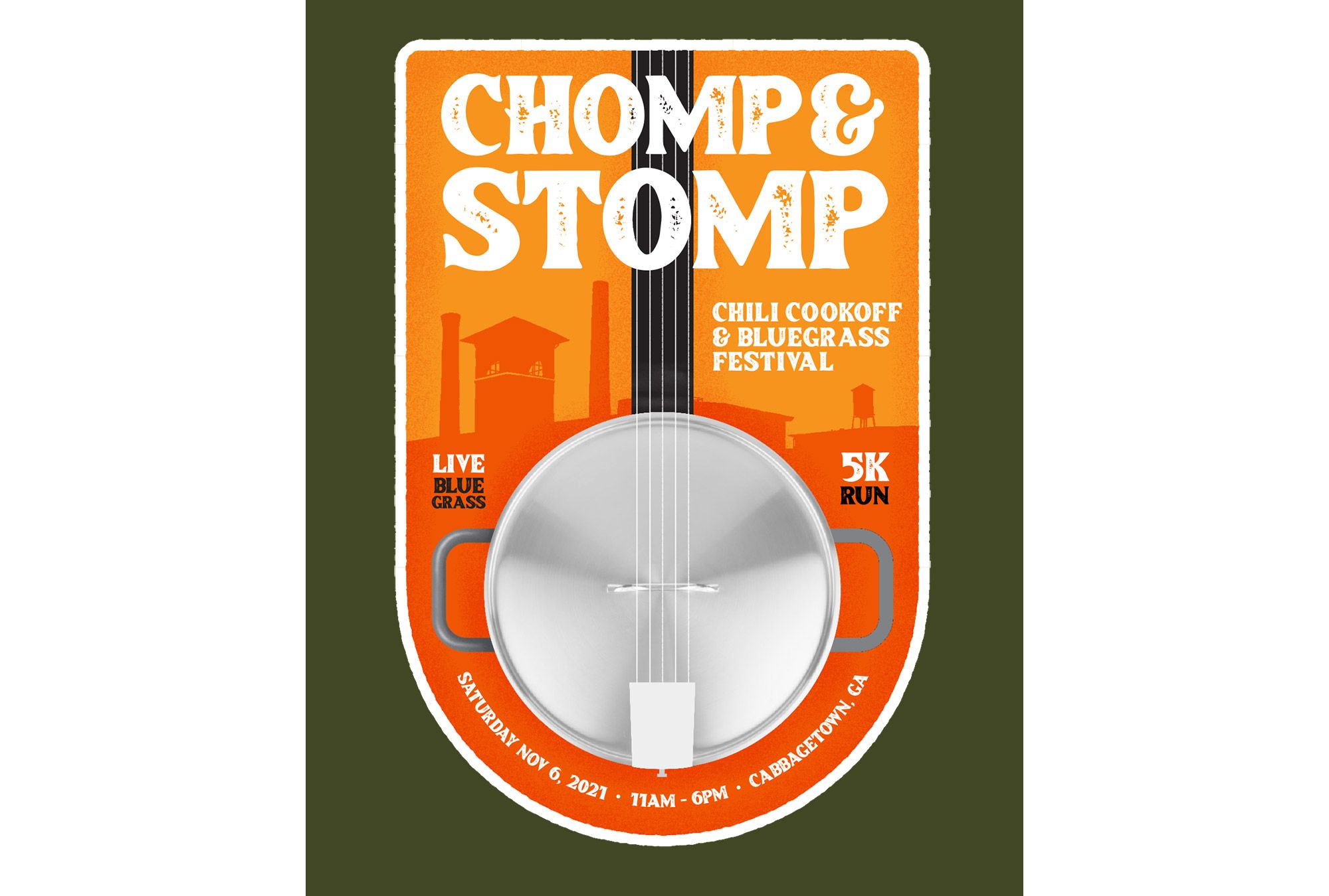
The organizers partnered with graphic designer Gary O-Bryan for the event design, initially to be put on posters to advertise the event around Atlanta.
In a non-pandemic year, Chomp & Stomp brings in over 10,000 people, and that’s not counting the 5K runners. A tiny neighborhood non-profit can pull off a massive event but they rely on many hands to complete the work.
Each year’s event is funded by the previous year’s success—meaning 2021 was working on a tight budget. Gary, along with event planners, worked with UberPrints to keep shirt costs low by modifying the original design.


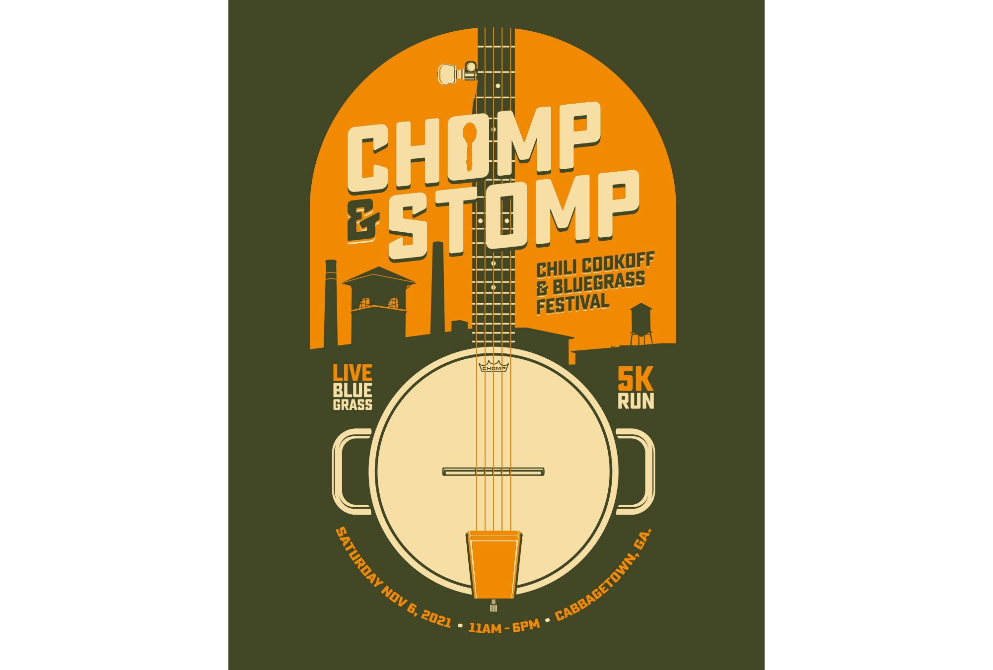
Making this shift eliminated 5 colors on the shirt, saving over $420 on the order overall.
Already making excellent choices, Gary made another brilliant design move: He used the t-shirt color as a third color element in the design.

Tips from Designer Gary O’Bryan on designing to reduce color costs
1. Spend more time researching than you do designing
Writers say their worst fear is a blank page. The same is the case for designing custom t-shirts: You might know what you want it to look like, but you don’t know how to make it. By collecting inspiration images from t-shirts you like (or already have), you’ll start further in the design process by knowing what you like and where you want to go.
Gary’s advice is to doodle, sketch, and look at what other t-shirts you like to get inspiration. Then when you begin designing, you already know what you want. The more time you spend thinking about what you want the final shirt to look like, the easier it will be to make it happen. Especially with tools like our Design Studio with pre-loaded clip art and design templates, you have many tools at your disposal to create and edit the design you need for your next t-shirt.
Start collecting your t-shirt inspiration on our Pinterest.
2. Pick a palette
Start with a color palette to work with. If the poster has three main colors, start there.
Before designing, Gary found his palette combo: Green, orange, and cream. Personally, Gary just likes dark colors. He delivered brown, dark blue, and black colors with his final design as options, but the Chomp & Stomp team decided on his original pick: Olive green.
If you need to keep your color count low for cost, pick one color for the majority of the shirt design, a second color for the accent, and use your t-shirt color as your third. Once you know how many colors you want in your design, next you need to select your elements.
3. Know your main elements
Once you have your colors in place, take the main two to three elements from your poster and use those as the main focus for the shirt. Slowly add other elements to the shirt as they fit.
Before he jumped into the design, Gary decided the banjo and the chili pot lid were going to be his main two elements in the design. As he developed the concept around those two fused elements, if they cluttered the design or competed with the main elements, they had to go.
4. Edit out fine details
Here’s a secret from our screen printers: Fine lines are NOT your friend.
When you go to edit your design, try to remove any fine lines or too small details. Removing fine details will also create more white space for your design to stand out and be bold.
In the final iterations, Gary continued to remove elements from the initial design. “Some little design elements aren’t planned. When I look at a design so long, some things just start to bother me—so I get rid of them.” This is how the final shirt design looks so clean with plenty of white space.
5. Change your perspective
Once you’re comfortable with your design, take a step back.
During his editing process, Gary knew he needed to visualize the design differently. So using his Photoshop skills, he created a mockup of how the design would look on a t-shirt. “I like putting my designs on mockups to change my perspective. Then I see things that need to be changed I wouldn’t have seen otherwise,” Gary said. He also relies on his fellow designer friends for outside feedback on his designs (even though he doesn’t always go with their advice).
If you’re logged in to your UberPrints Account, you can save your design and come back later. Since the Design Studio creates designs directly on the shirt, your mock up is automatically created.
How’d it go?
Let’s get down to the meat and potatoes: Did the shirt SELL?
For attendees, t-shirts are more than repping a cool event or shirt. Participants look forward to collecting shirts from year to year.
"Shirts are always an iconic part of the festival. People collect them and seek them out, even if they're unable to make it to the festival," 2021 Chomp & Stomp Chair Lauren Appel said. "Last year, UberPrints helped us make money when there was not a festival to be had."
This year was important for event planners to prove a safe, successful fundraiser was possible again. And it worked, the event was a total success. Chili was a hit once again, hundreds shopped the pop-up markets, and over 10,000 people came out to listen to the bluegrass in the renowned Atlanta neighborhood. T-shirt sales made 5% of funds raised, selling over 150 shirts.
Not only is designing with a color count in mind helpful on the front-end, but it reaps rewards when it comes to increasing your profit margins during sales.
Your next live event t-shirt is gonna be great
Live events may have restrictions or virtual options not offered previously. One way event planners can ensure it will be a success is t-shirts that make it real. You’ll boost sales and give your attendees that warm-and-fuzzy feeling when they get a quality shirt they get to show off in their wardrobe.
Snag the same shirt Chomp & Stomp chose for its event this year.
