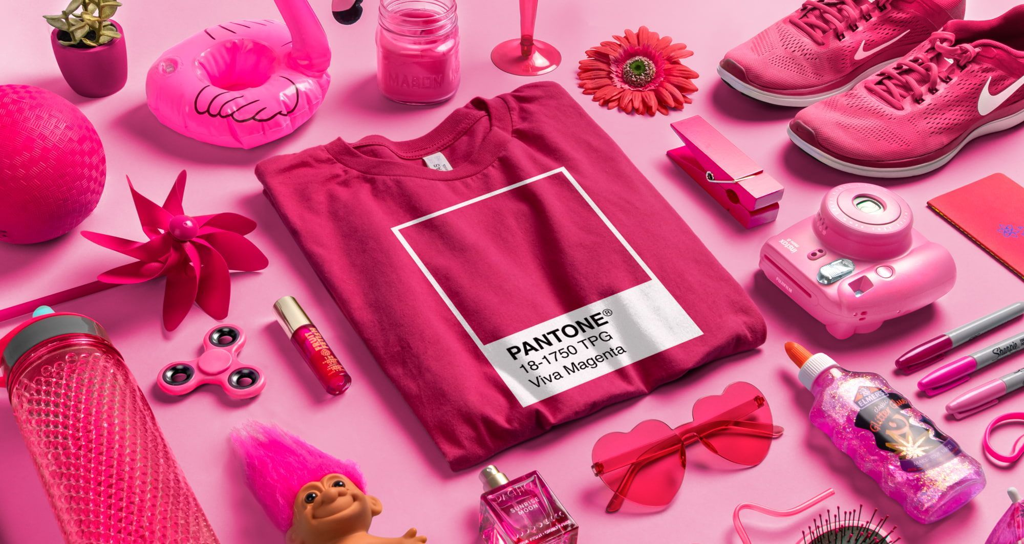

Viva Magenta is PANTONE 18-1750, the Pantone Color of the Year for 2023. Pantone calls it a nuanced crimson red, a carmine descended from the red family and inspired by cochineal, one of the strongest natural dyes there is. On screen it reads as a deep, electric pink-red. On a t-shirt it does one thing better than almost any other color: it refuses to be ignored. Here is how to use it well, whether you want the whole shirt shouting or just one detail doing the talking.
The short version
- What it is: PANTONE 18-1750 Viva Magenta, a crimson-carmine red that leans pink. Not a purple.
- What it does on a shirt: maximum visibility. Nobody in a magenta shirt gets lost in a crowd.
- Three ways to use it: as the whole garment, as a single accent on a neutral, or as the anchor of a palette.
- Pairs best with: white and cream for contrast, charcoal for edge, gold and orange for warmth, teal and sage for tension.
- Print note: bright magenta ink on a dark shirt needs a white underbase on screen print. Magenta on white is the cleanest, cheapest version.
- Best for: group shirts, spirit wear, events, bachelorette weekends, and any brand that wants to be loud on purpose.
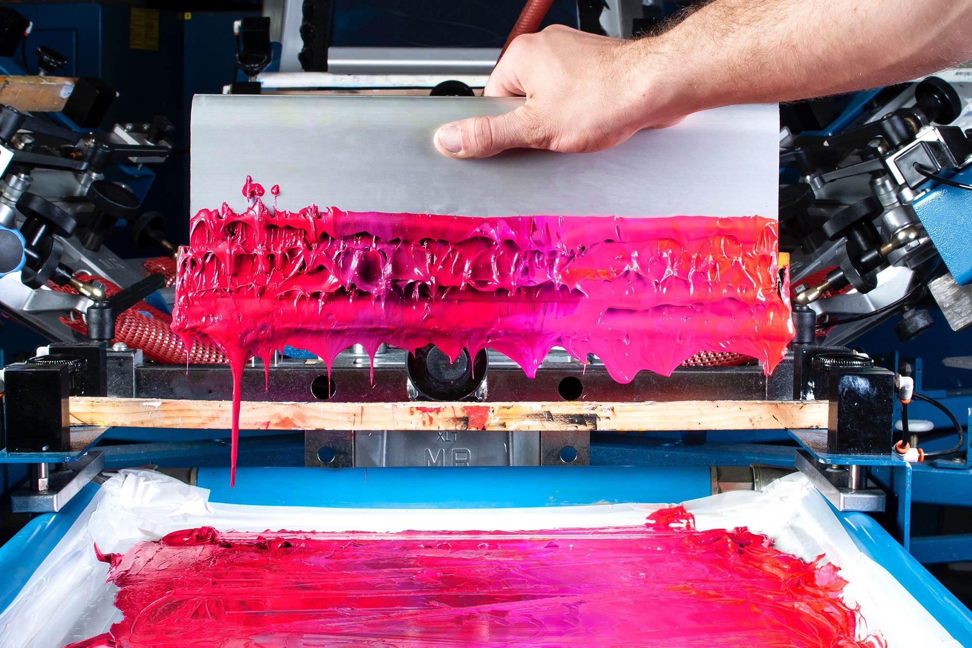
What is Viva Magenta?
Pantone named Viva Magenta its Color of the Year for 2023, describing it as assertive but not aggressive, a shade that takes what they called a fist-in-a-velvet-glove approach. That phrase is doing a lot of work, and it is accurate: the color is loud without being harsh. It is not a neon. It is not a Barbie pink. It has enough red in it to feel grounded and enough pink to feel fun.
The origin story is the part designers tend to like. Viva Magenta is drawn from cochineal, the insect-derived carmine dye that has produced some of the most intense reds in textile history. It is one of the oldest and strongest natural dyes in existence, which is a nice thing to know when you are putting it on fabric specifically.
The practical takeaway: treat it as a red that leans pink, not as a pink that leans purple. That distinction changes what you pair it with, which is where most magenta designs go wrong.
Why does magenta work so well on a t-shirt?
Because most of the reasons you order custom shirts in the first place are reasons magenta is good at.
- It is findable. A magenta group in a crowded park, stadium, airport, or convention hall is trivially easy to spot. This is not a style argument, it is a logistics one.
- It photographs beautifully. Magenta pops in every photo, in every light, against every background. Your event recap reel writes itself.
- It is genuinely flattering. Magenta is one of the rare bold colors that works across a wide range of skin tones, which matters when you are ordering for a group of forty people who did not get a vote.
- It reads as confident. A neutral shirt is safe. A magenta shirt is a decision. If your brand or your event has any personality at all, this color announces it before anybody reads the front.
Worth knowing: bold colors do more heavy lifting than complicated artwork. A simple design on a magenta shirt almost always outperforms a busy design on a gray one.
Three ways to use Viva Magenta in a t-shirt design
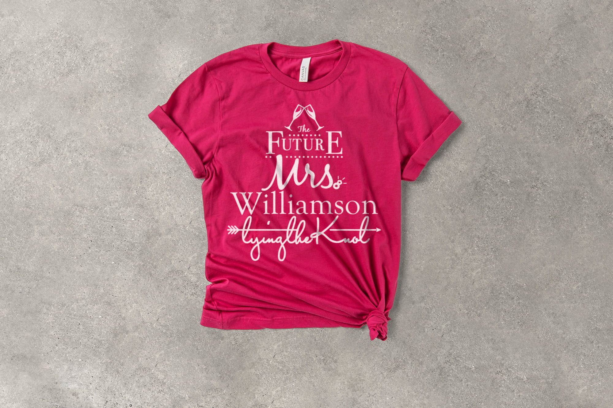
1. Make it the whole shirt
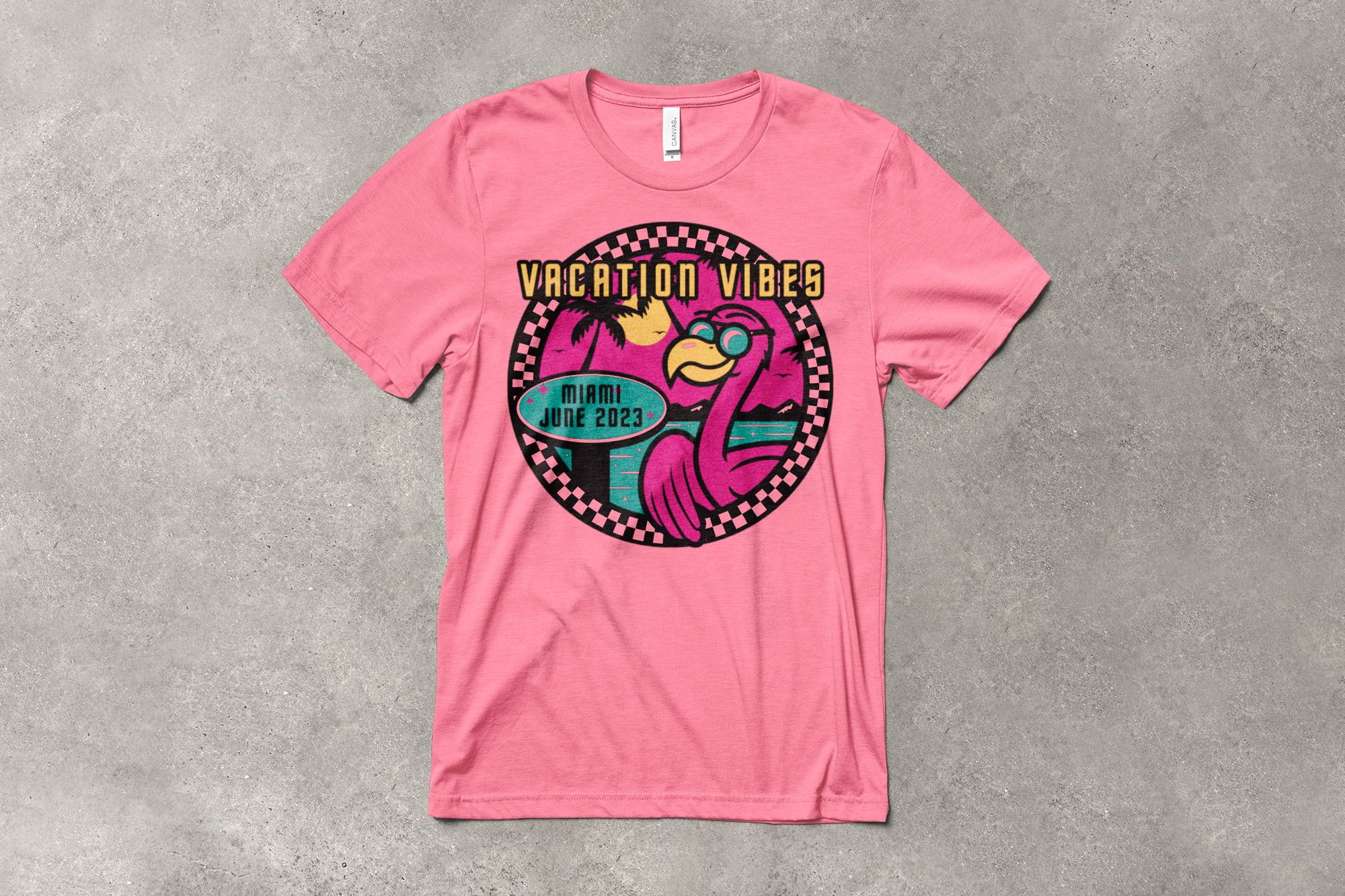
The most direct move, and usually the right one. A magenta garment with a simple print in white, cream, or black. The color carries the shirt and the artwork just has to be clear.
This works best when your design is bold and uncluttered: a chunky wordmark, a single icon, a short phrase in heavy type. Fine detail and thin lines struggle to compete with a saturated background, so give the artwork weight. Think of the shirt color as the loudest voice in the room and write the design accordingly
2. Use it as the accent
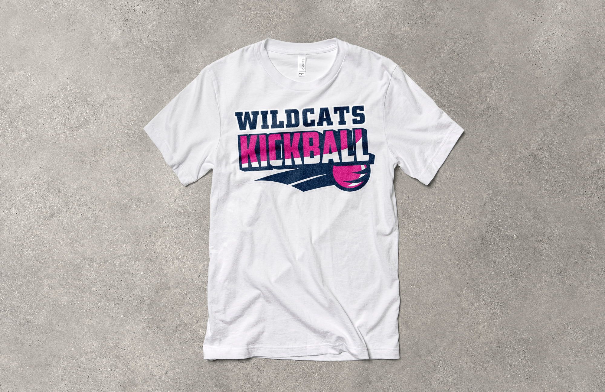
A white, cream, or charcoal shirt with magenta doing one specific job. The logo. A single word. A stripe, an underline, a small mark on the sleeve.
This is the more grown-up version, and it is what most small businesses should reach for. You get the energy of the color without committing the whole garment to it, and the shirt still works on a Tuesday with jeans. It is also easier to wear for people who would never buy a bright pink shirt on their own, which widens who actually puts it on.
3. Build a palette around it
Magenta plays well with others, but not with everything. Give it one or two companions and a lot of breathing room. Three bold colors and a bold shirt is a fight nobody wins.
The reliable structure: magenta as the anchor, one supporting color, and a neutral to separate them. That gives you a design with depth that still reads instantly from ten feet away.
What colors go with Viva Magenta?
Here are the pairings that hold up on fabric, and what each one is actually good for.
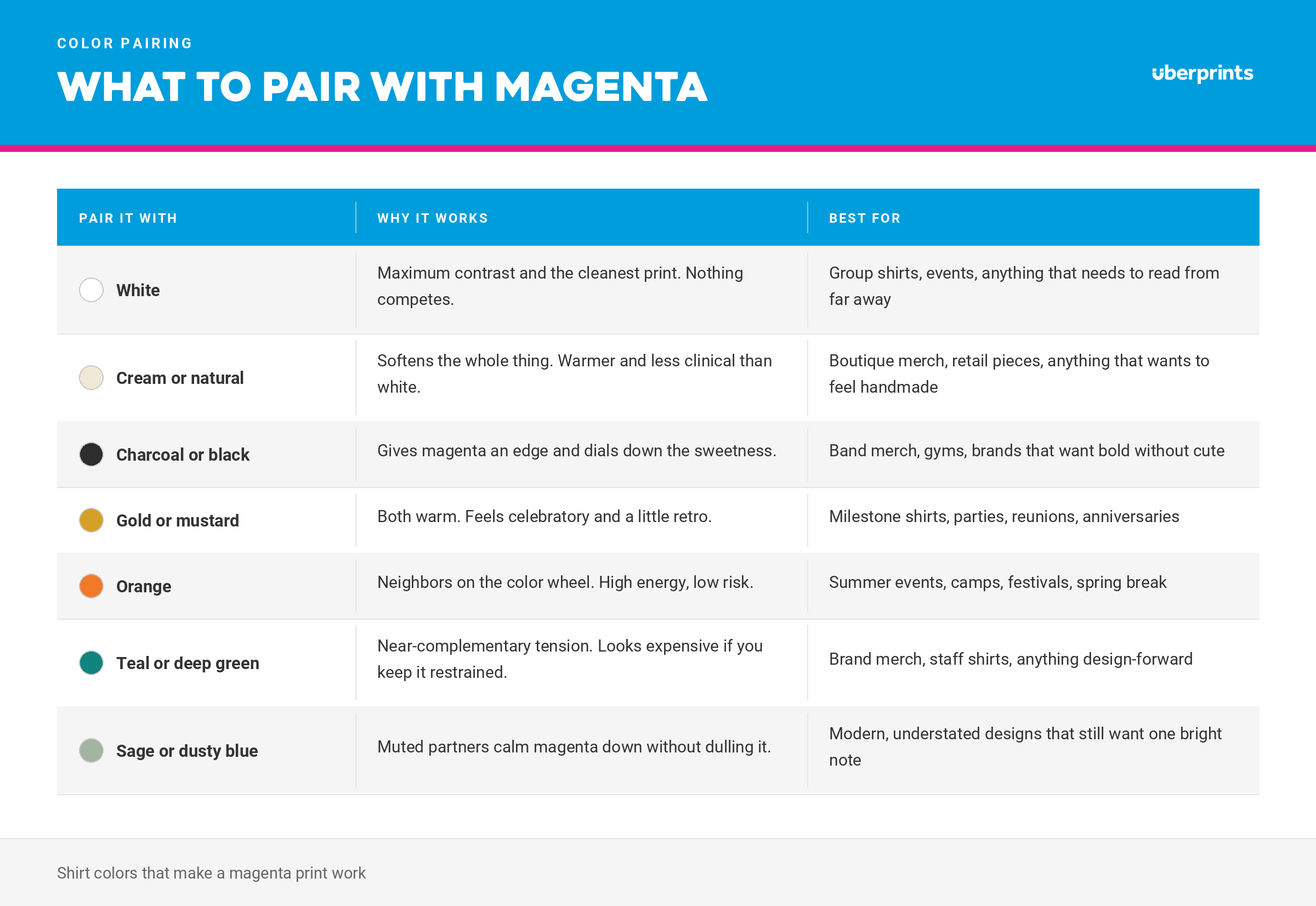
The one combination to handle carefully is magenta and purple. They sit close enough that the design can go muddy fast, and it is exactly the mistake people make when they think of magenta as a purple in the first place. If you want both, separate them with a hard neutral.
Who should design with Viva Magenta?
Reach for it when being noticed is a feature, not a risk.
- Group and event shirts. Field days, 5Ks, theme park trips, family reunions, conference booths. Anywhere you need to find your people.
- Bachelorette and celebration shirts. Magenta is festive without being pastel, which is a gap a lot of party shirts fall into.
- Spirit wear and fundraisers. Bright, photographable, and easy to spot in a stadium.
- Small-business and brand merch. Especially for brands whose whole point is that they are not beige.
- Band, artist, and creator merch. High contrast, high energy, reads well in a photo and on a phone screen.
Skip it when the shirt needs to disappear. Corporate uniforms in conservative industries, anything meant to be worn under a jacket, and any design where the artwork itself is the star and needs a quiet stage. Charcoal and heather gray exist for a reason.
Make it yours
Every idea here is a starting point. In the Design Studio you can:
- Change any ink color to match your brand palette
- Swap the shirt color and watch the design update live
- Add names, numbers, a date, or an inside joke
- Upload your own logo or artwork
- Move the print to a left chest, sleeve, or back placement
No design background required. Pick a template, change the colors, and you are most of the way there.
Start designing
Magenta is not a subtle color and it is not trying to be. If your shirt has a job to do - get seen, get photographed, get your group back together after lunch - this is the shade that does it.
Browse t-shirt design templates
Start from scratch in the Design Studio
What color is Viva Magenta?
Viva Magenta, PANTONE 18-1750, is a nuanced crimson red that leans pink. Pantone describes it as a carmine red descending from the red family, inspired by cochineal dye. It is a red with pink in it, not a purple.
What year was Viva Magenta the Pantone Color of the Year?
2023. Pantone announced it in December 2022 and described it as assertive but not aggressive, taking a fist-in-a-velvet-glove approach.
What colors go with Viva Magenta?
White and cream give you the cleanest contrast. Charcoal and black add edge. Gold and orange feel warm and celebratory. Teal and sage create tension that reads as expensive. Keep it to one or two companions plus a neutral, and be careful pairing magenta with purple - they sit close enough to go muddy.
Is magenta a good color for group t-shirts?
Yes, it is one of the best. Magenta is easy to spot in a crowd, photographs well in any lighting, and flatters a wide range of skin tones, which matters when you are ordering for a group that did not pick the color.
Can you match Viva Magenta exactly on a custom t-shirt?
Not exactly in most cases. Blank garment colors are manufacturer shades dyed in lots rather than Pantone references, so they land close rather than perfect. Screen print inks can be mixed much nearer to a specific reference, so if precision matters, put the exact color in the ink and use a neutral garment.
Does magenta cost more to print?
Not on its own. But printing bright magenta ink on a dark shirt requires a white underbase, which adds an ink color to the job and can affect your quote. Magenta artwork on a white or light shirt needs no underbase, and a magenta garment with white artwork on top is usually the most cost-effective route of all.
What kind of design works best on a magenta shirt?
Bold and simple. Heavy type, solid shapes, and one or two ink colors. A saturated shirt competes with fine detail, so thin lines and small text tend to get lost. Let the color carry the energy and keep the message short.