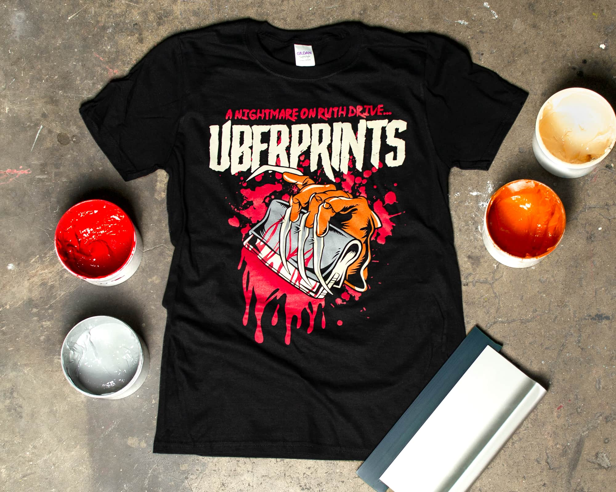
Halloween is always a fun time of year at UberPrints. Amidst the excitement of planning costumes for our annual party, it’s always an opportunity to see the really creative and unique ways our customers use their own custom t-shirts to celebrate. With our designers at the ready, we too couldn’t pass up this year’s All Hallows’ Eve without making a special t-shirt design to get us in the spooky spirit.
A nightmare on Ruth Drive...
If you’re not familiar with our designer Ben, he has a long history of creating bold posters for punk rock bands like Blink-182, but you can also thank him for a lot of the awesome design templates you can find on our site.
He took a break from designing clip art for our customers to give us a Freddy Krueger inspired t-shirt design that’s a perfect marriage of UberPrints and horror. A Nightmare On Ruth Drive is an homage to our Athens, Georgia headquarters and wouldn’t be complete without a screen printing squeegee clutched in his razory glove.
From computer screen to printing screen
We thought this would be a great opportunity to showcase our screen printing process and give some behind-the-scenes shots of how a design like this is ends up on a t-shirt. A couple months ago, we put together a pretty lengthy article with important knowledge on how the screen printing process works, but we thought seeing this t-shirt come together would help fill in the gaps.
One-off designs like this start in Adobe Photoshop, and when we get the chance to make our own designs in-house, the artwork prep stage of the process is a breeze.
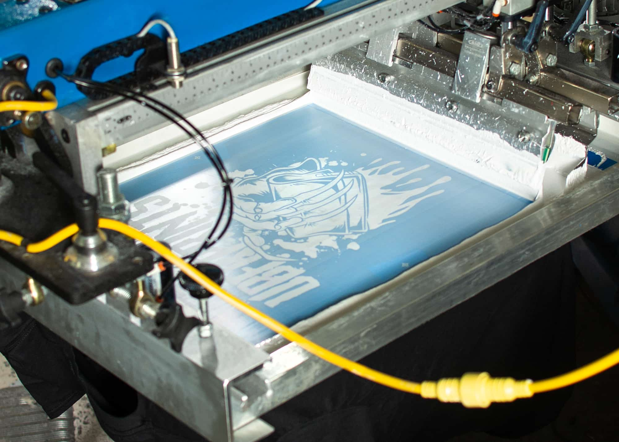
After making screens for each of the 4 colors in this design, we also need one more to give it the jump-off-the-shirt look we’re going for. Because we’re printing this design on a black t-shirt, the bright ink colors we’re using need a white underbase printed down first so the finished product looks as vibrant as possible.
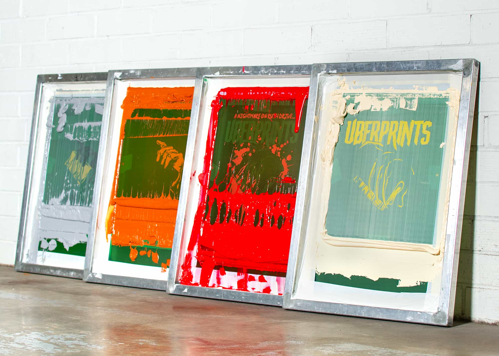
In the image above, you can see the underbase screen we used printing an initial layer of white ink beneath all of our subsequent colors.
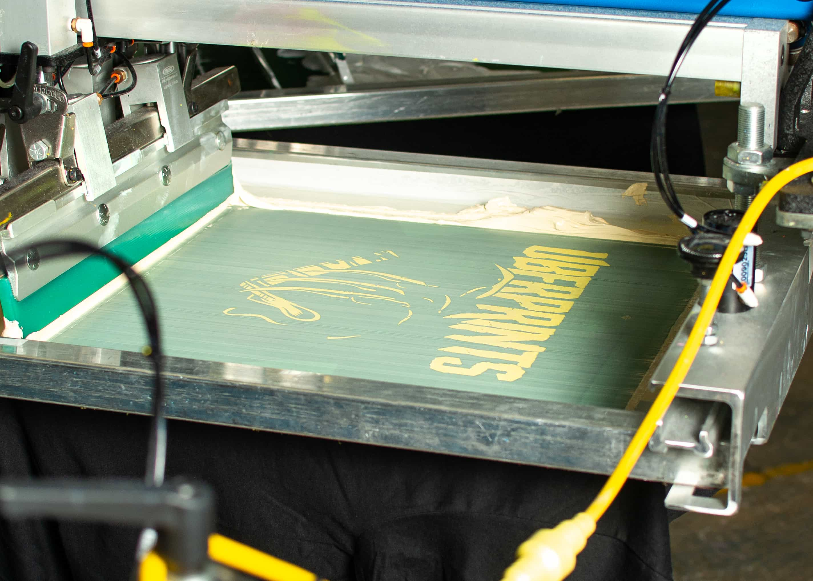
Now we can move on to the rest of our colors, starting with the light cream. Not only used for the UberPrints name, it also conveniently adds highlights to the glove below it.
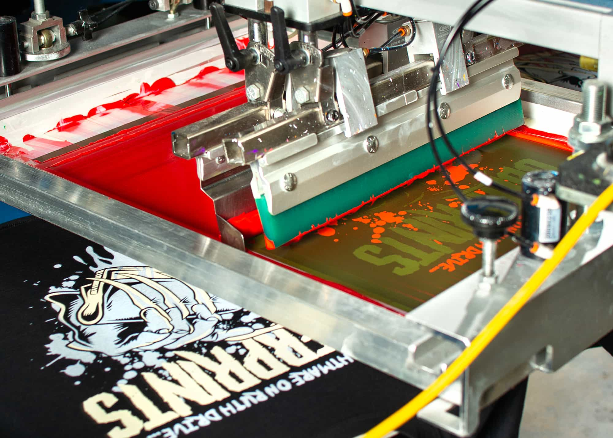
The bright red that’s next is what really gives this print its pop. The image above is an awesome look at how these different color layers come together on the shirt. To the left you can see the white underbase and cream already printed, and right next to it, the red layer ready to go down.
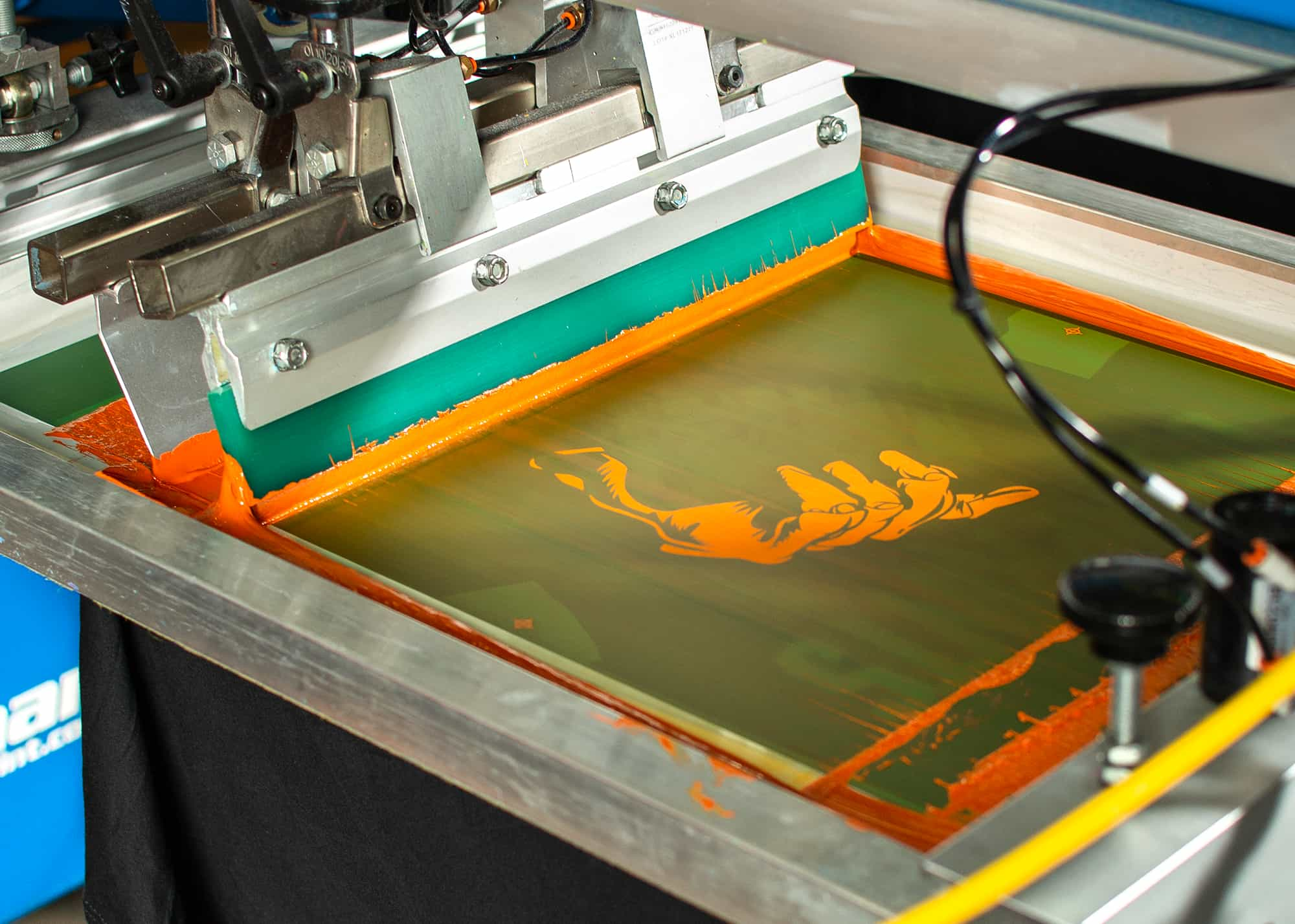
Each shirt continues its path around the press, receiving the rest of its ink colors before being pulled off and placed on our belt dryer to cure. And if you haven’t noticed already, this example showcases automatic screen printing that’s just a bit more high-tech than the handheld squeegee most are used to seeing. This kind of set up really lets us dial-in perfection for those larger orders.
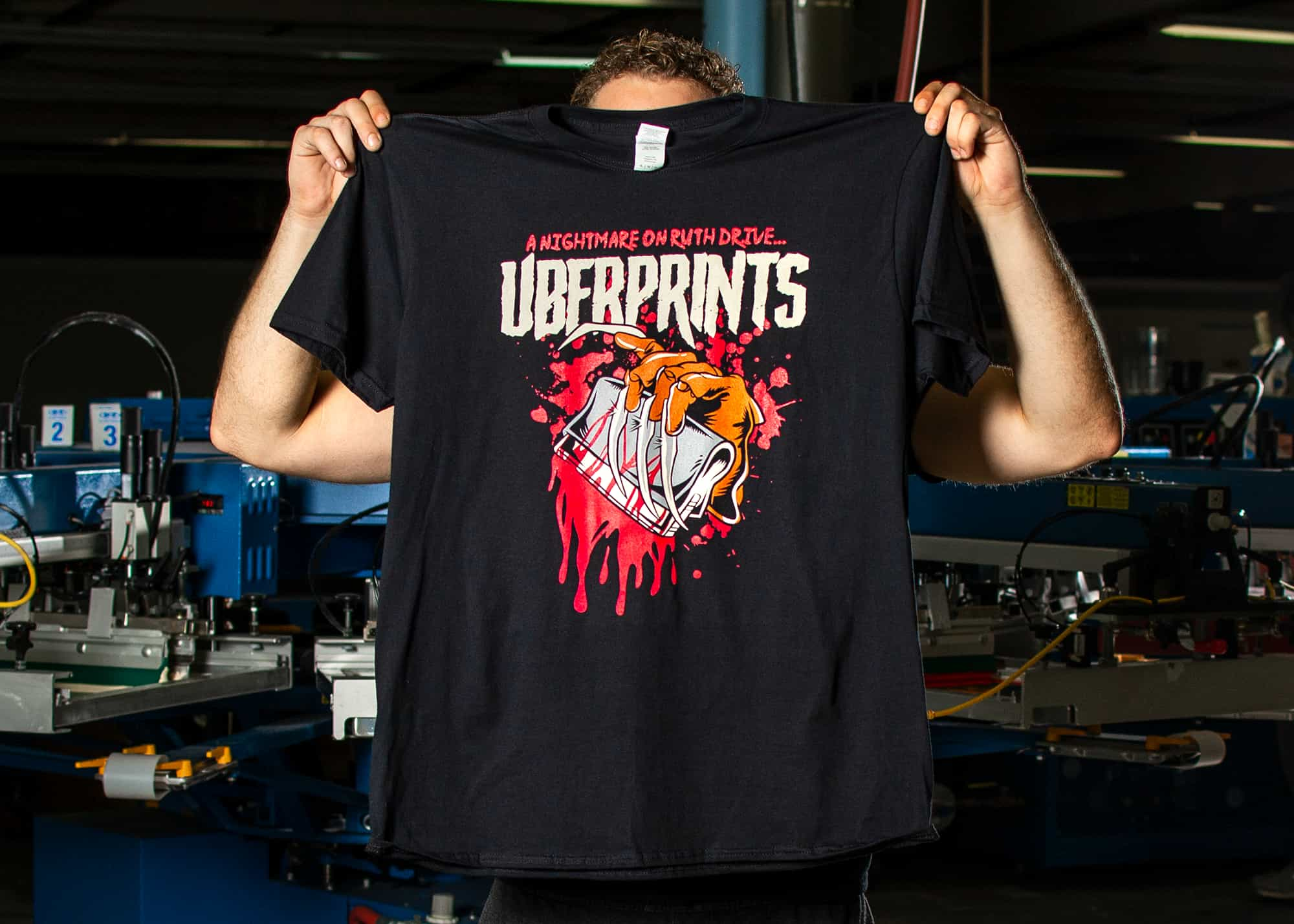
When all the colors are brought together, you can really see the impact a design like this has on a t-shirt. And a really important part of this design is how the black of the t-shirt is used as 5th color.
Using the t-shirt color in the design is not only a way to save a bit on cost, but it often makes for better looking designs. The final print will usually look better integrated with the fabric color and give you the feeling that the background is woven into the design. In this case, Ben used the black of the t-shirt as the outline and shadow of the hand and squeegee — a common tactic used in t-shirt designs.
With a whole lot of mess to clean up and pristine, newly printed t-shirts out of the dryer, the whole UberPrints team ended up with a fresh new design to celebrate this week.
